“long story short,” is a podcast for young adults who are going through the emotional process of growing up. “long story short, 2021” is an established issue of this podcast, where we discuss the change on how a young adult approaches their adulthood, and the realization of how they are growing up in this unprecedented situation, how their surroundings have changed, and the way they are coping with that change.
This project aims to evoke the feelings of uncertainty in its audience, while providing a sense of camaraderie: growing up is hard, but you are not in this alone. "long story short" immerses the audience in an emotional experience by engaging them in 3 senses: sight, hearing, and touch.

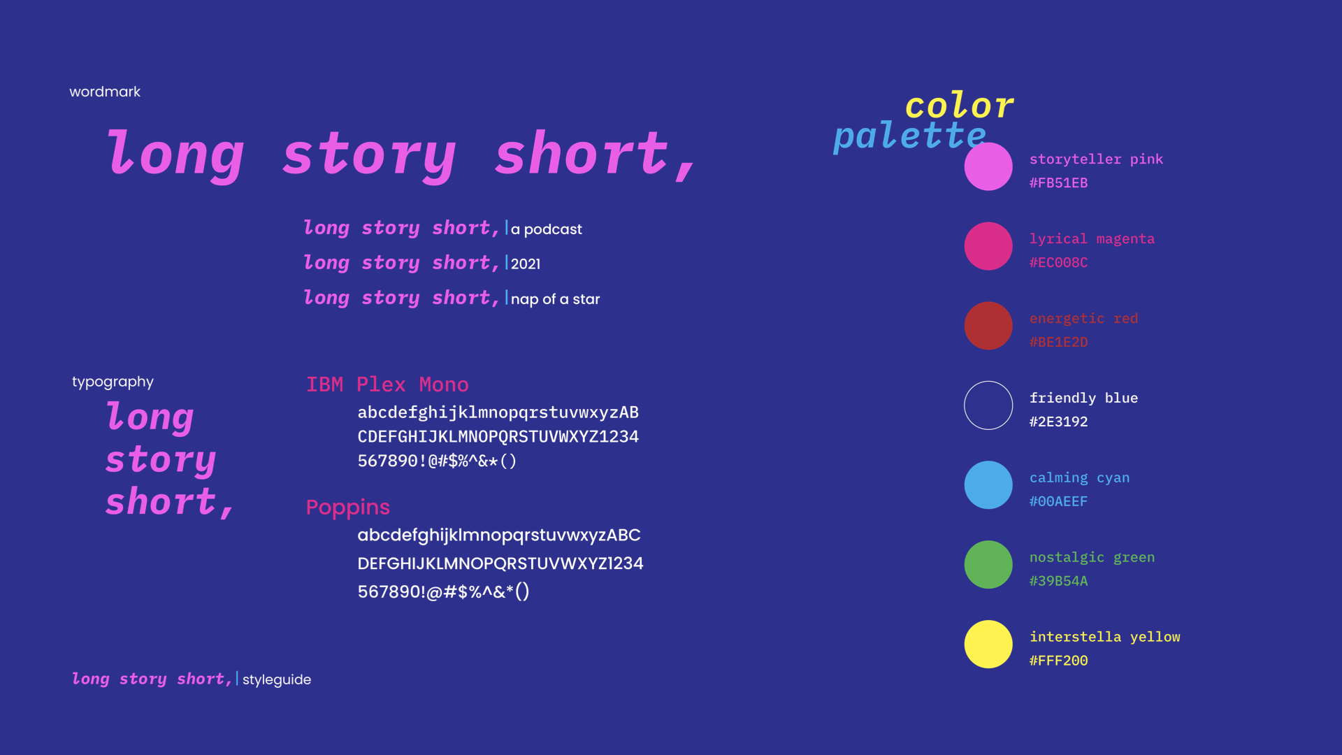
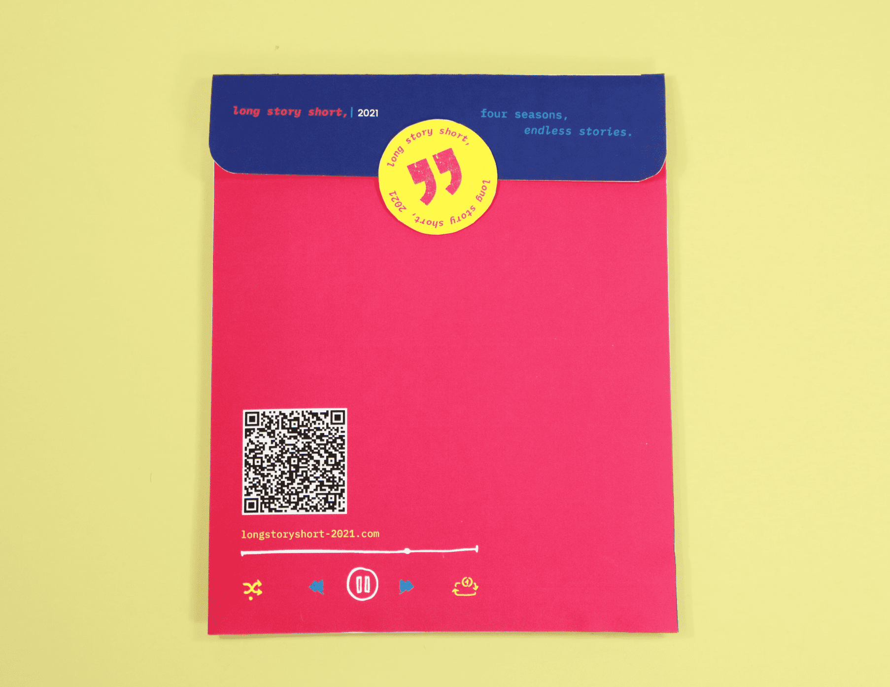
For the brand style guide, the “long story short” logo is a wordmark ending with a comma, indicating that there is always more to come. Sub-marks usually come with a caret cursor after the brand logo mark to separate the overall brand with the individual applications. With IBM Plex Mono and Poppins being the 2 main typefaces and the youthful, energetic color palette, “long story short” wants to relate to its audience, making sure to let them know that the brand identifies with them, and that their stories are told in the way they want them to be.
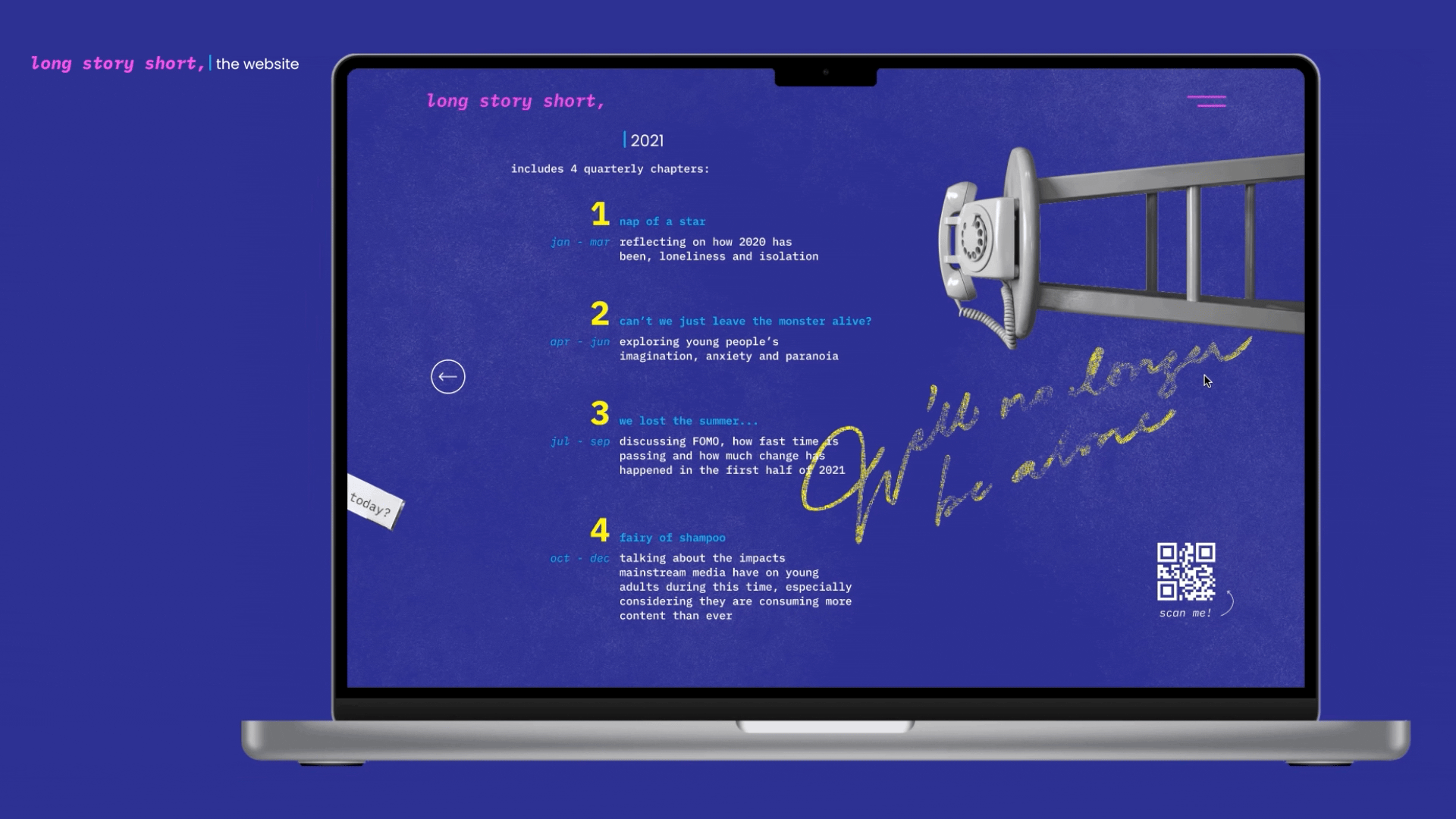
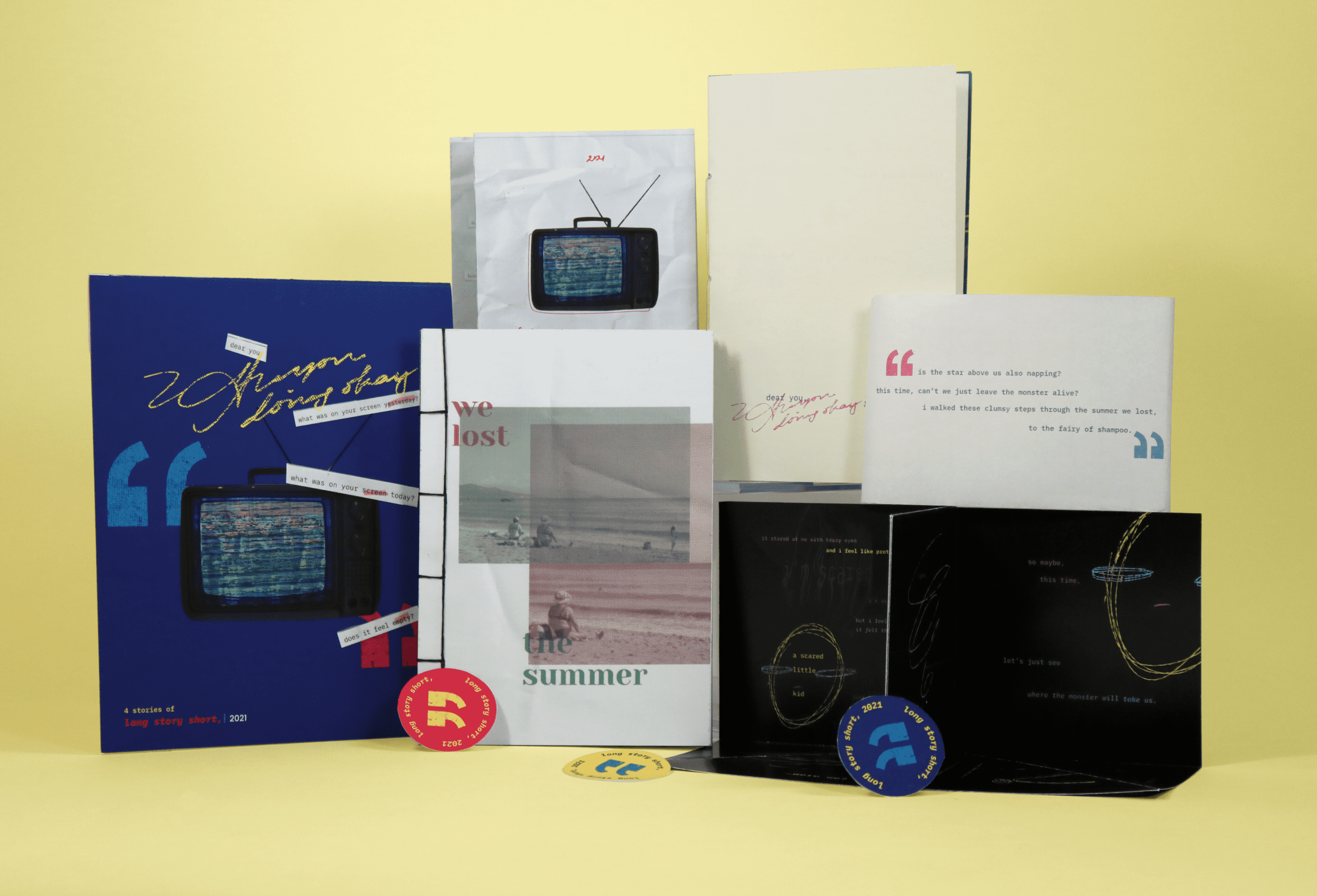
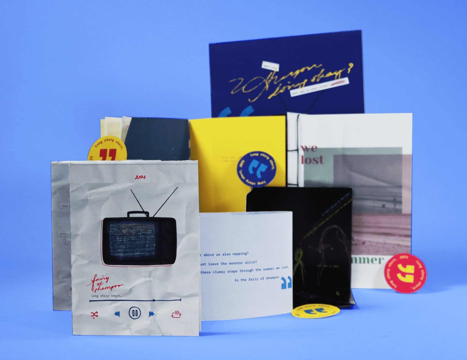
In the “long story short, 2021” issue, all podcast episodes are broken into 4 quarterly chapters, each of which corresponds to an umbrella theme that is discussed in those episodes.
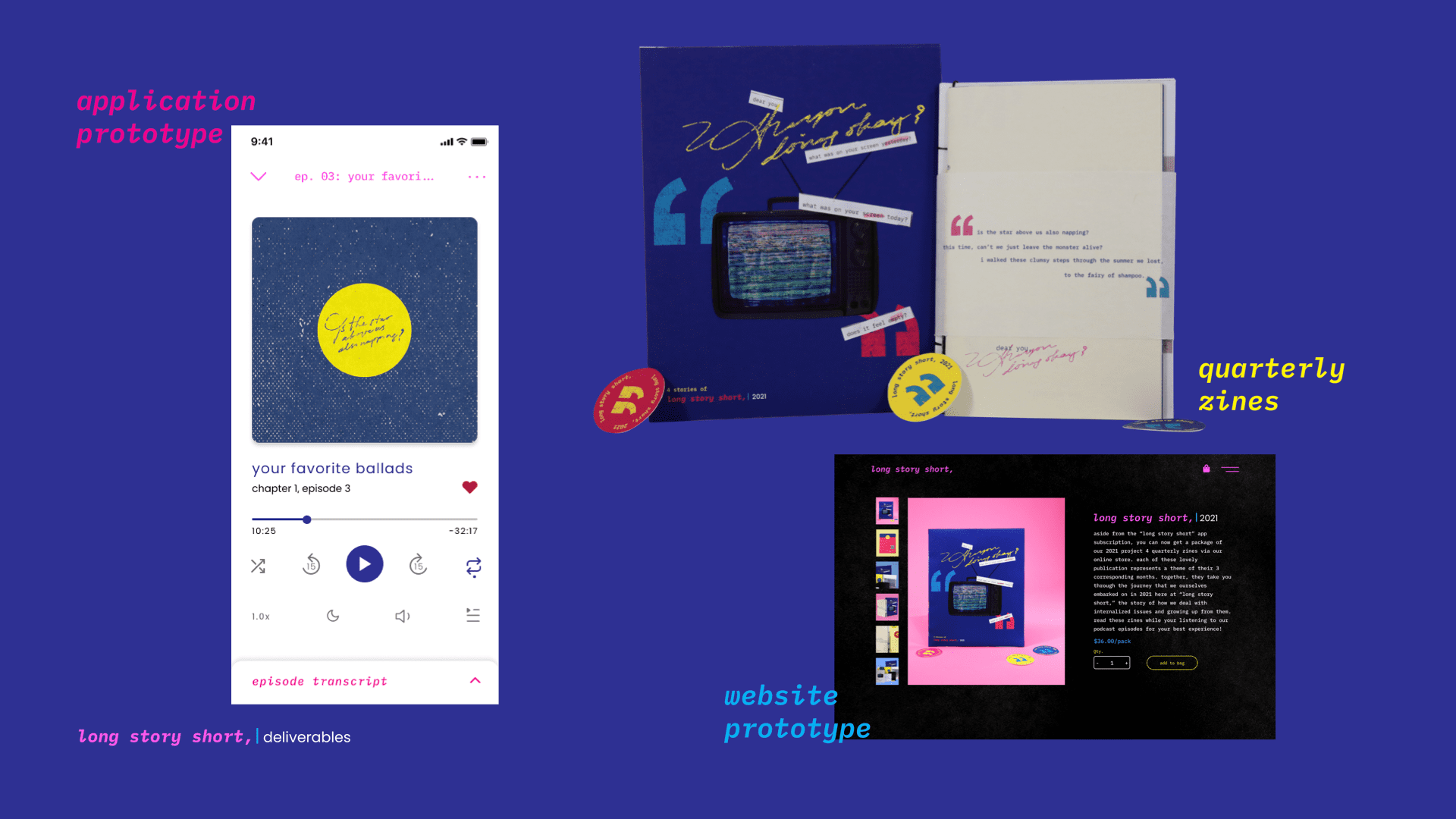
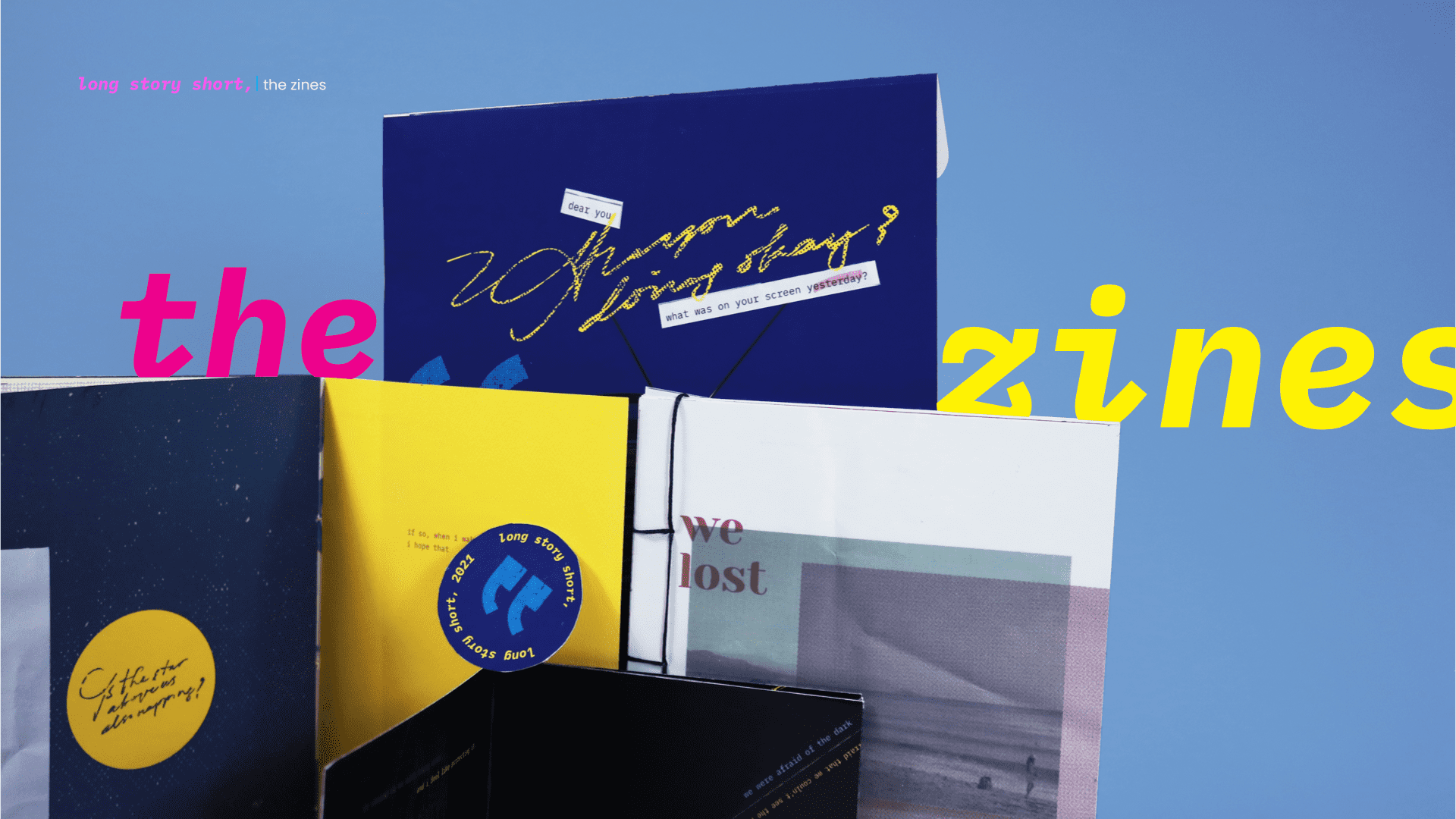
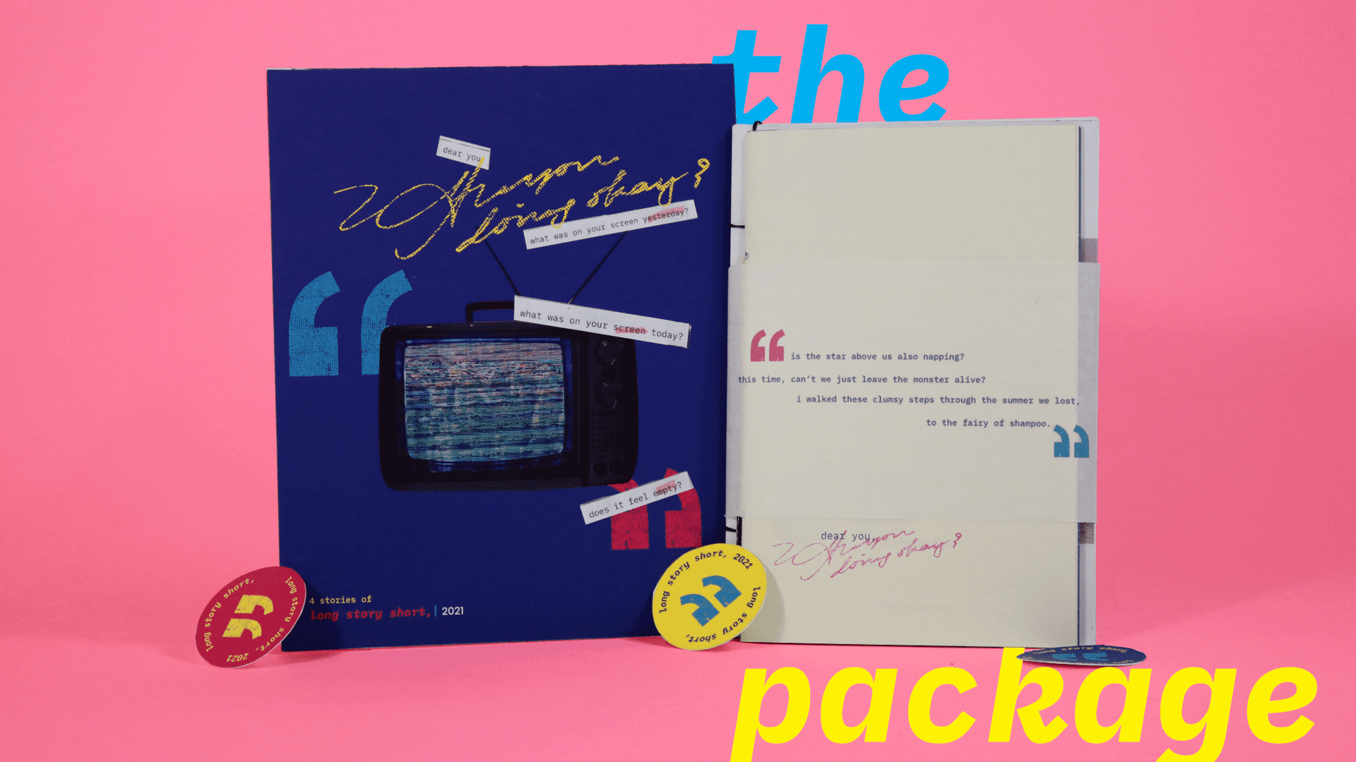
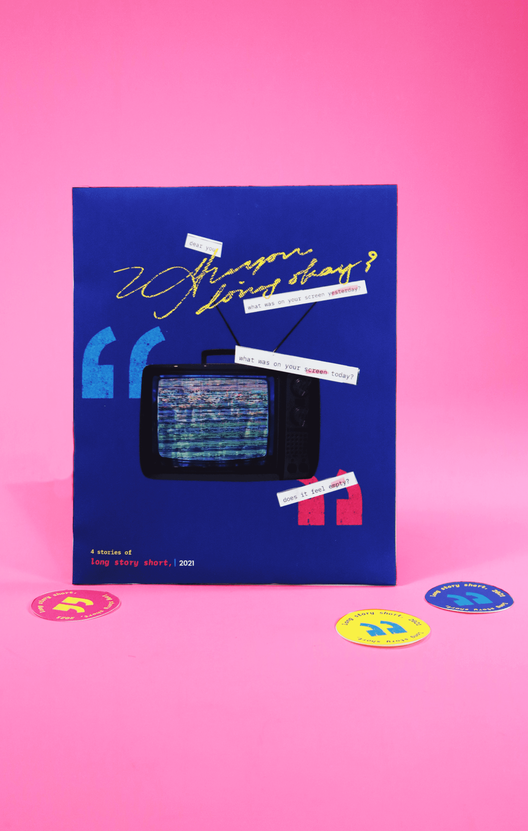
Each quarterly chapter in the “long story short, 2021” issue has a zine or booklet that visually captures the emotions discussed in that chapter’s podcast episodes. The audience of “long story short,” can purchase these publications via a subscription service or on the website at the end of the year. These zines take the umbrella theme of their corresponding quarter, and create a visual sysyem that evokes the feelings that the podcast episodes are trying to bring to the audience.
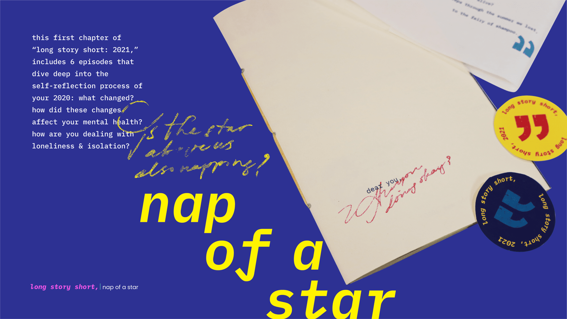
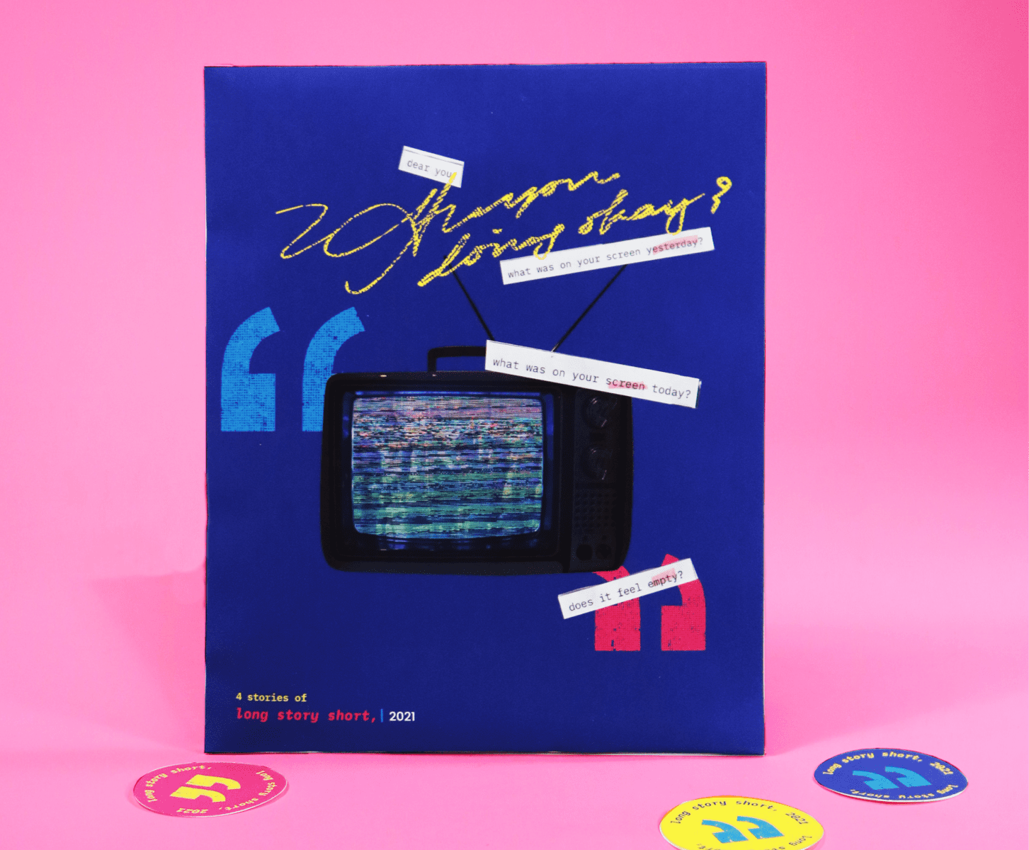
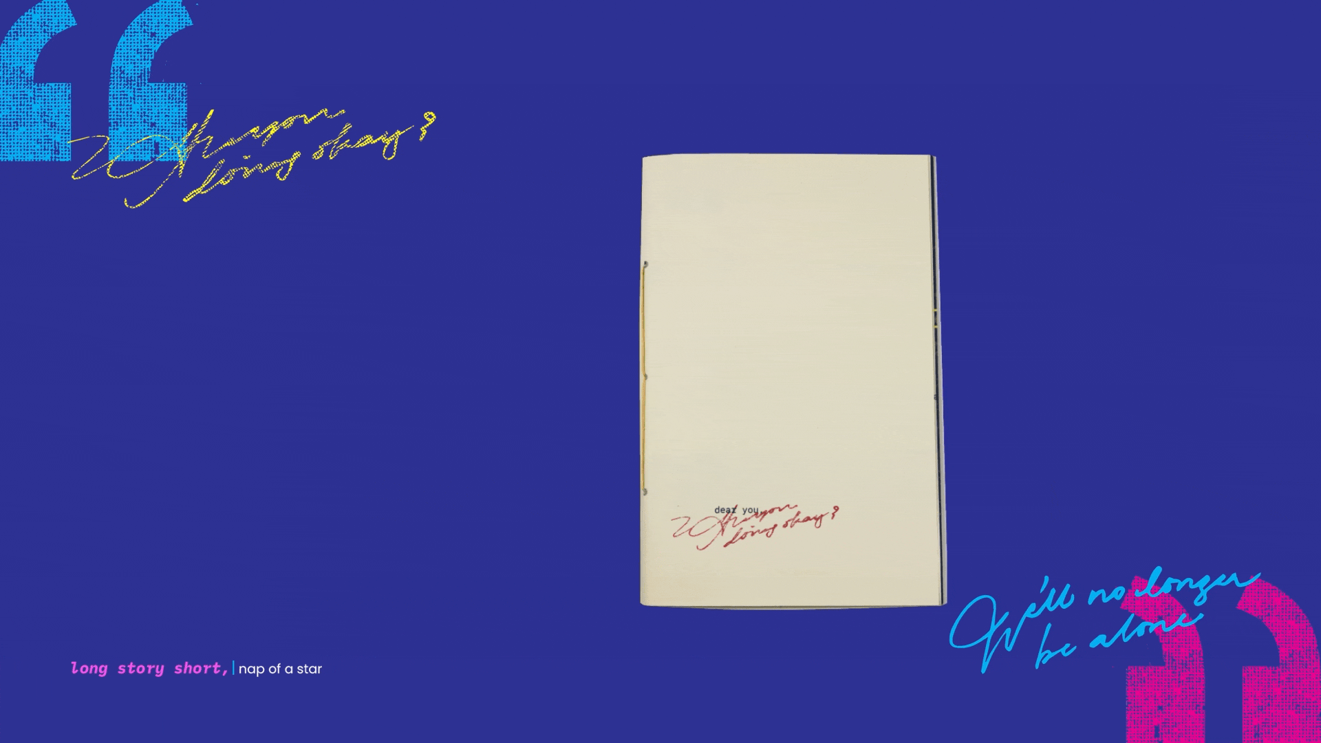
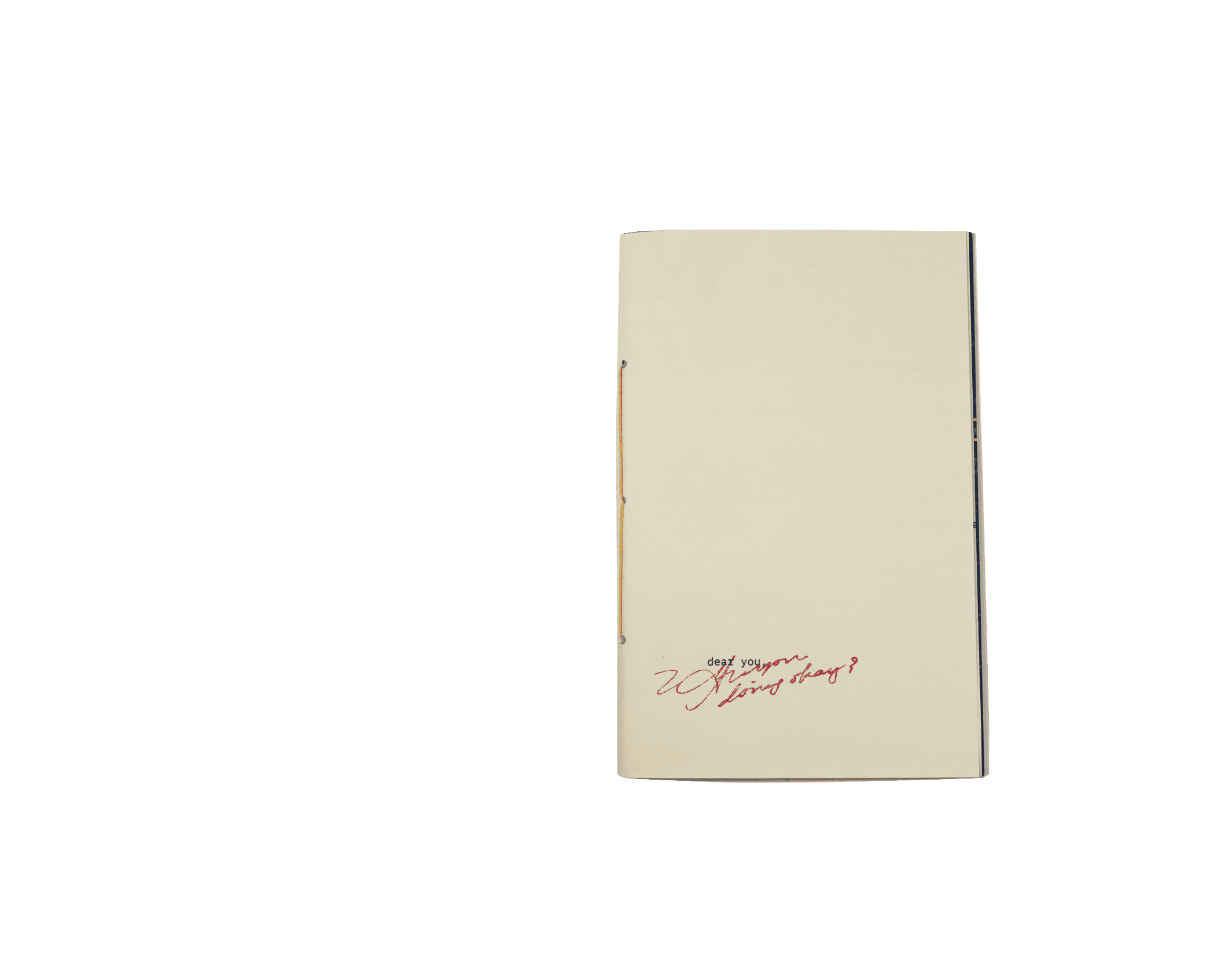
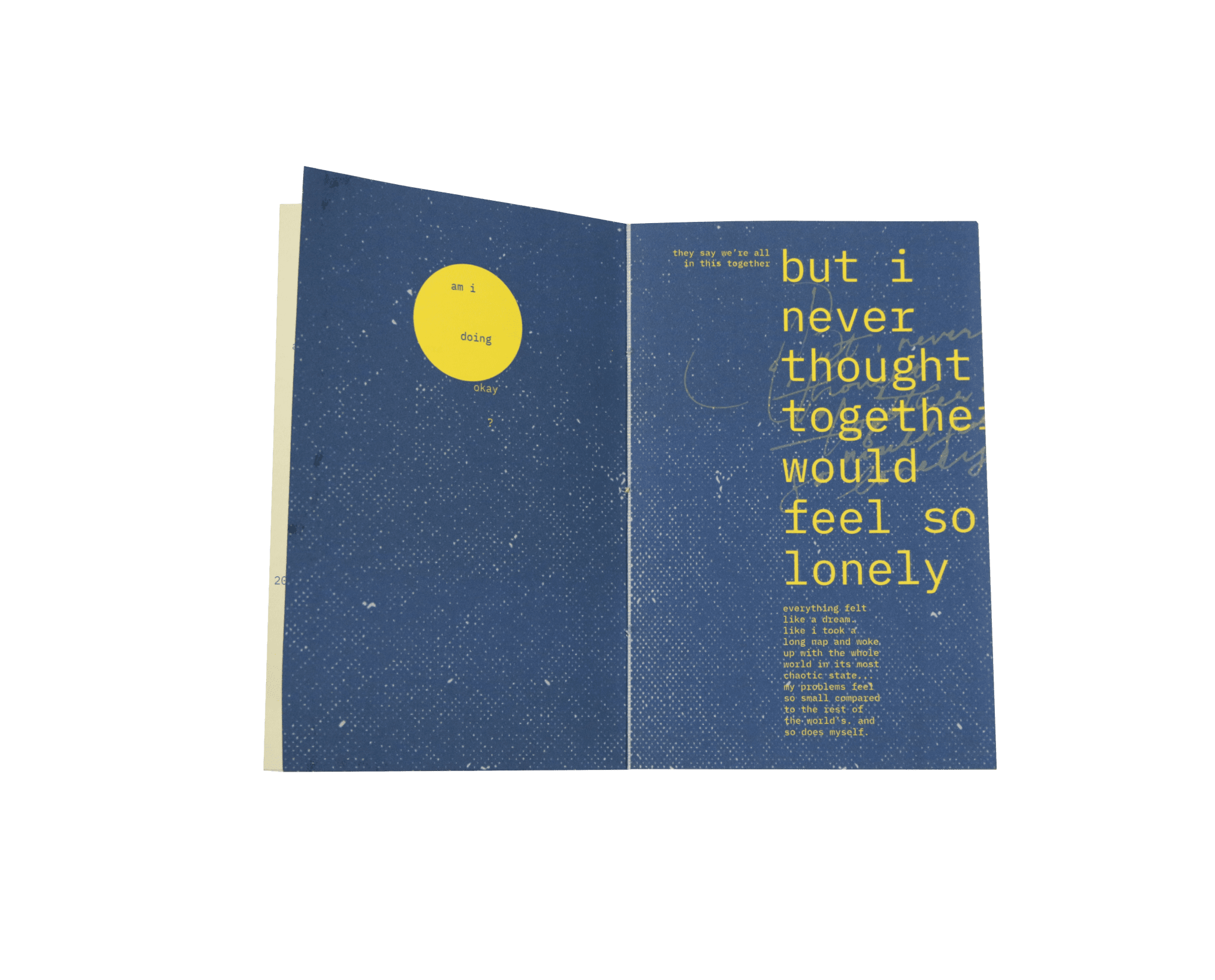
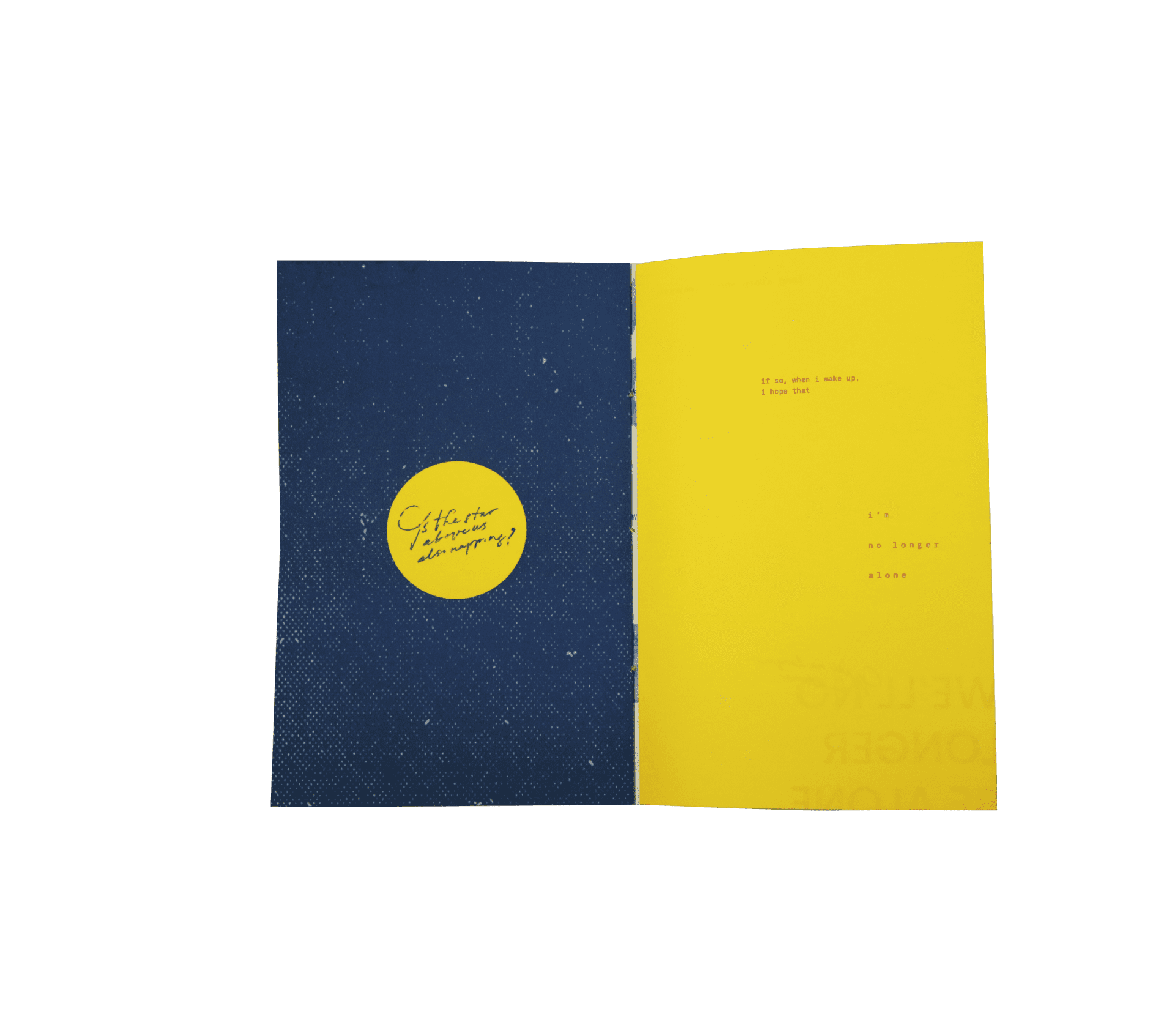
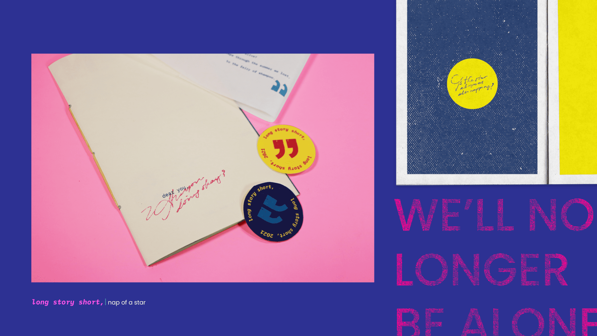
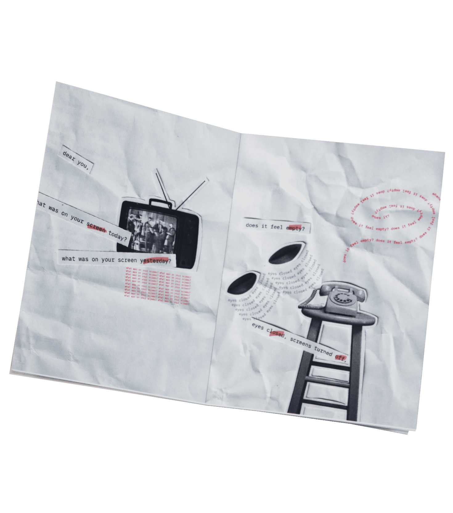
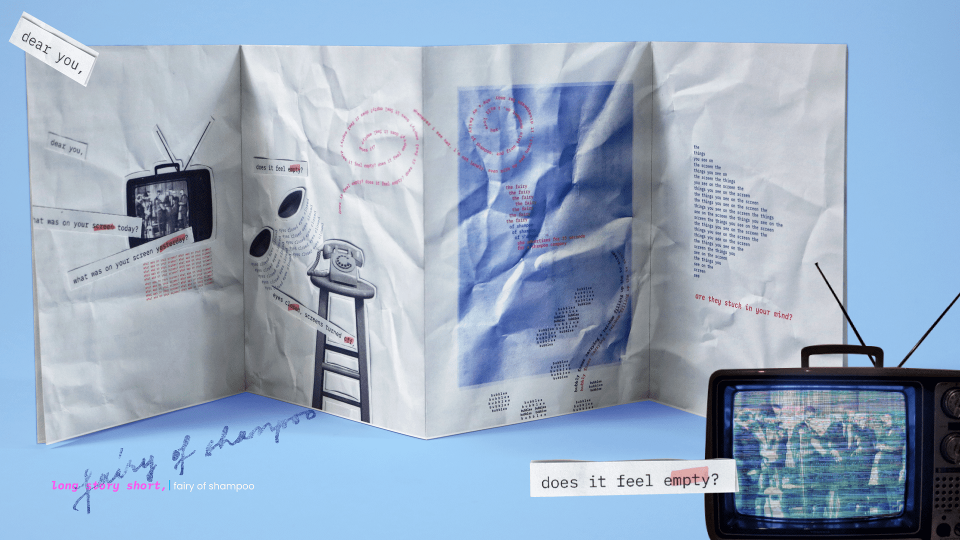
All of the zines start out with the greeting “dear you.” These zines are letters that the protagonist in all these chapters wrote to their loved ones: a friend, a partner, a sibling, basically a confidante that they know is having the same emotions they’re having. The zine is filled with the same questions: “how are you? how was 2020? are you doing okay?” This repitition of these pleasantries reflects the start of 2021: everybody was asking and being asked these questions. The thought process went on, where the writer asks themselves if they are napping, if the readers are napping, and whether the stars above them are also napping; or is everything that happened all real. To end this chapter, the writer emphasizes that if the whole universe is napping, when everyone wakes up, they hope that we will no longer be alone.
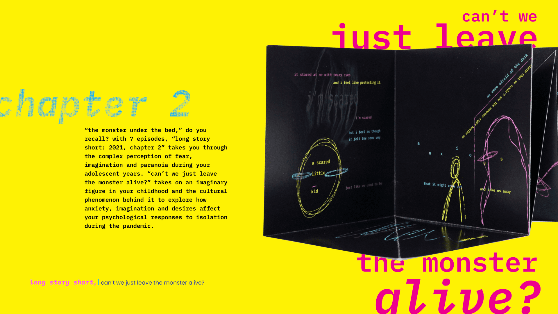
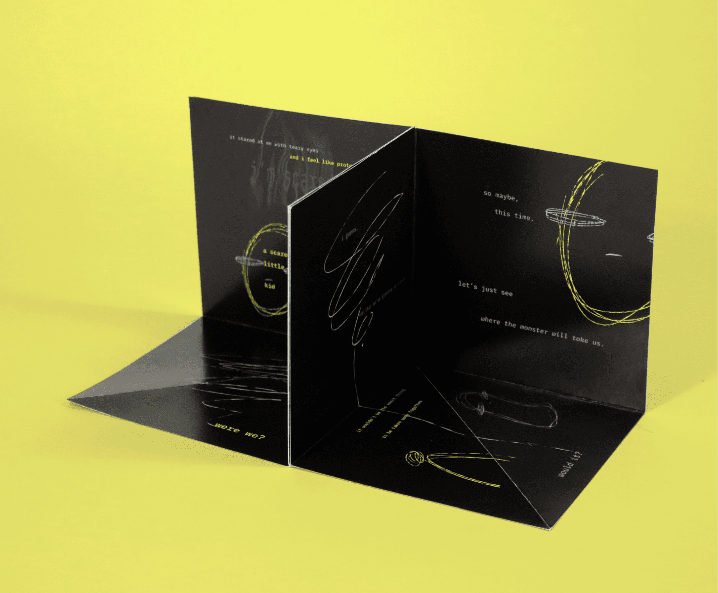
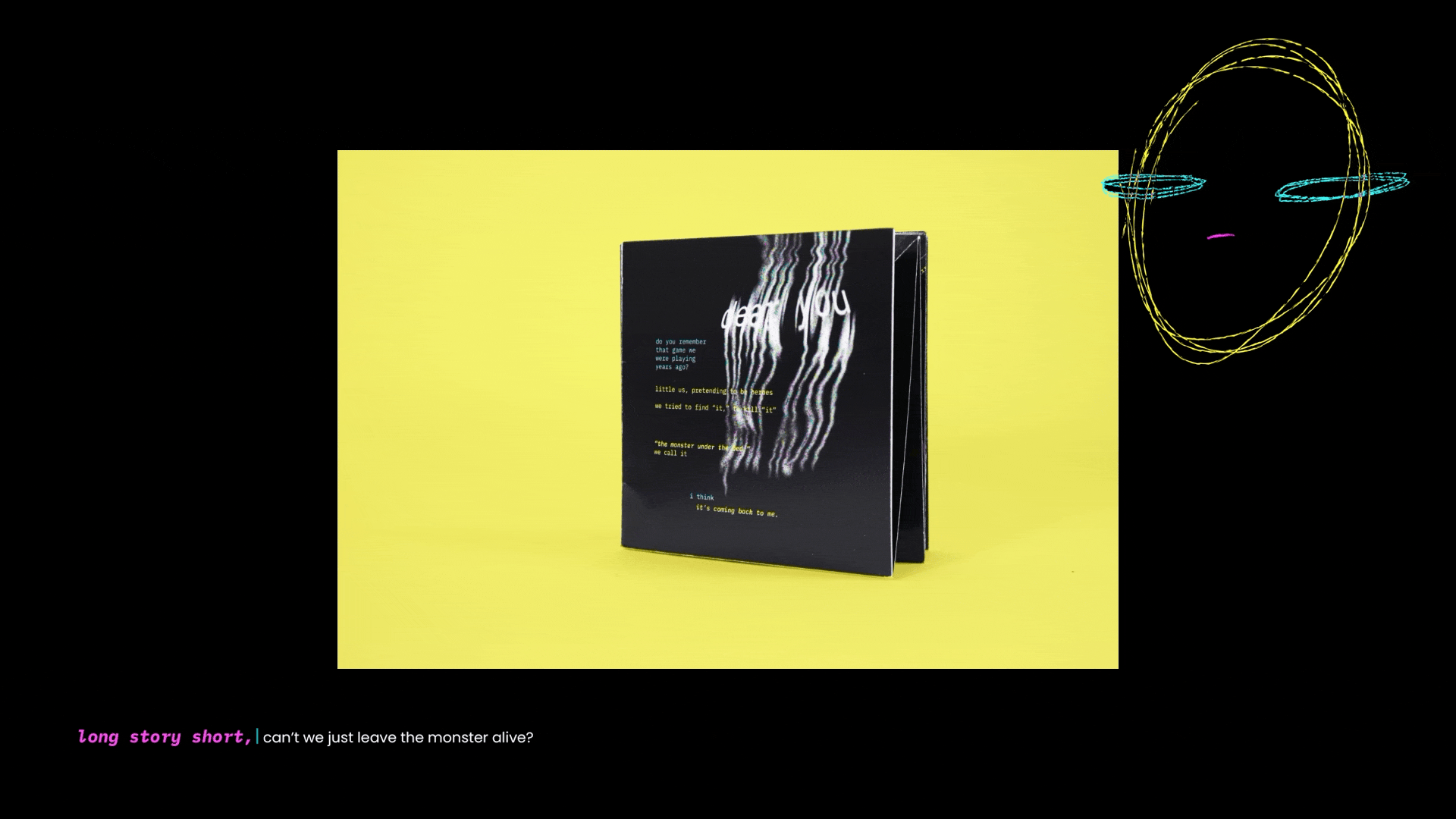
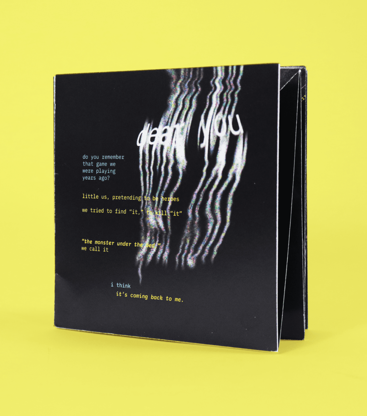
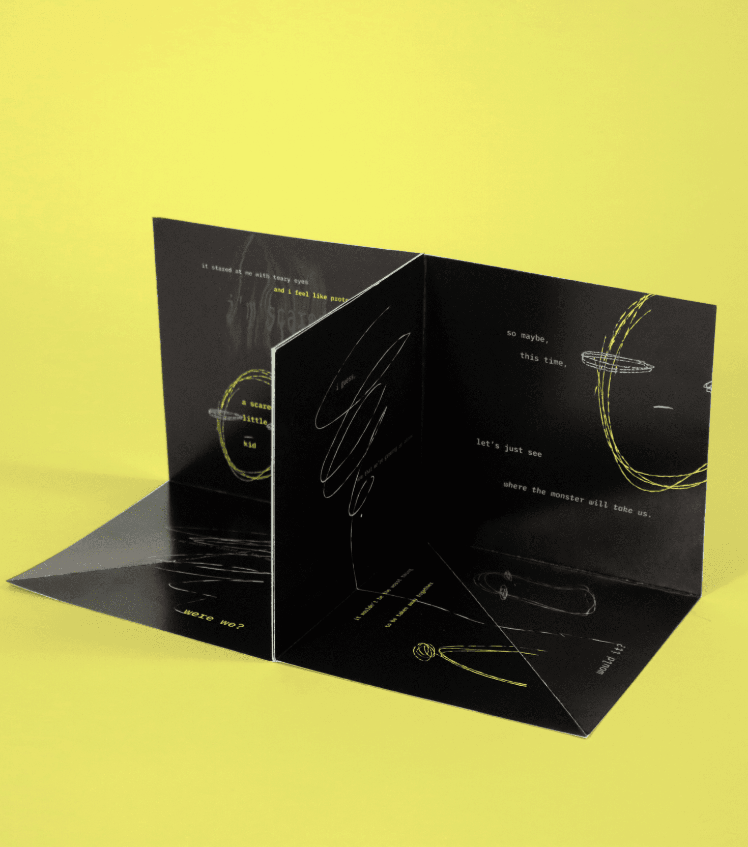
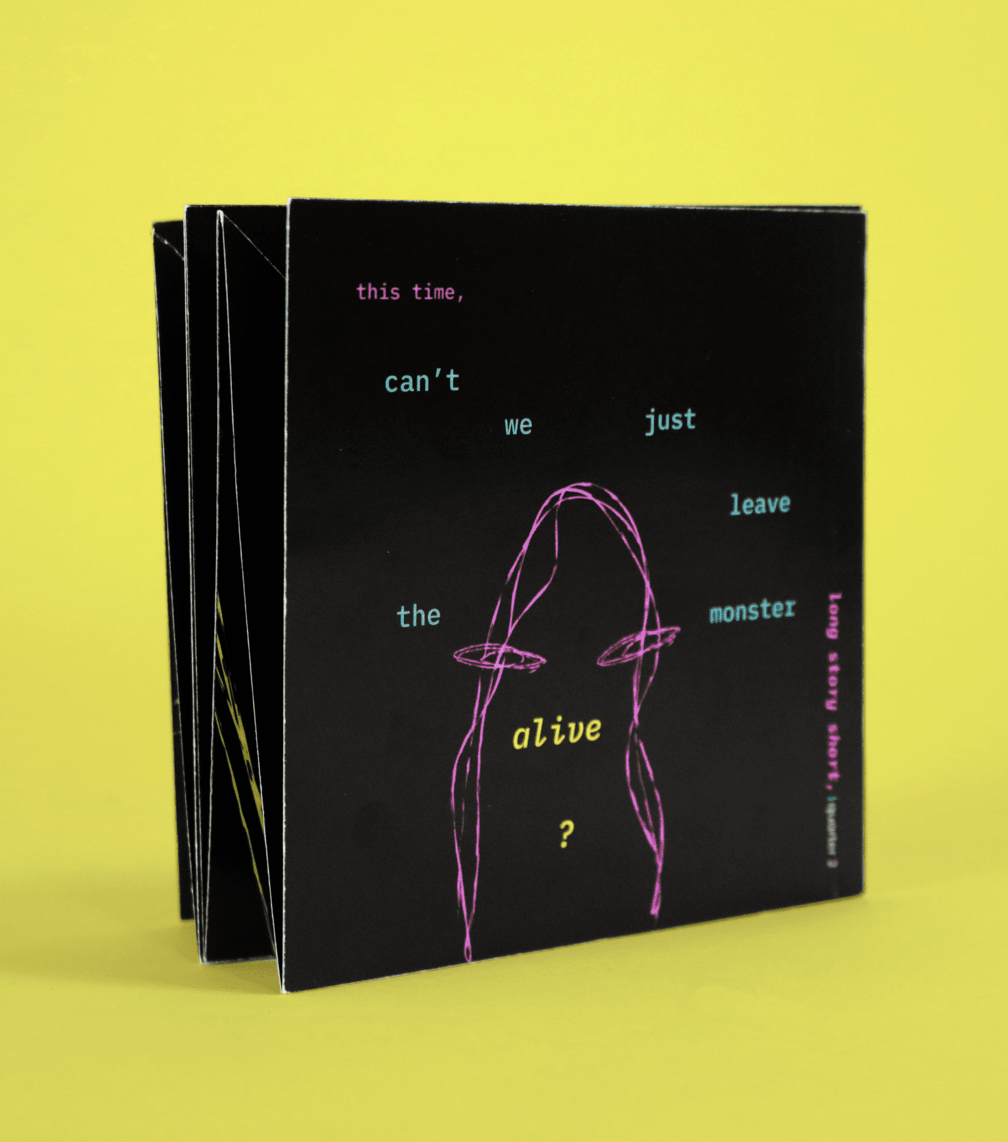
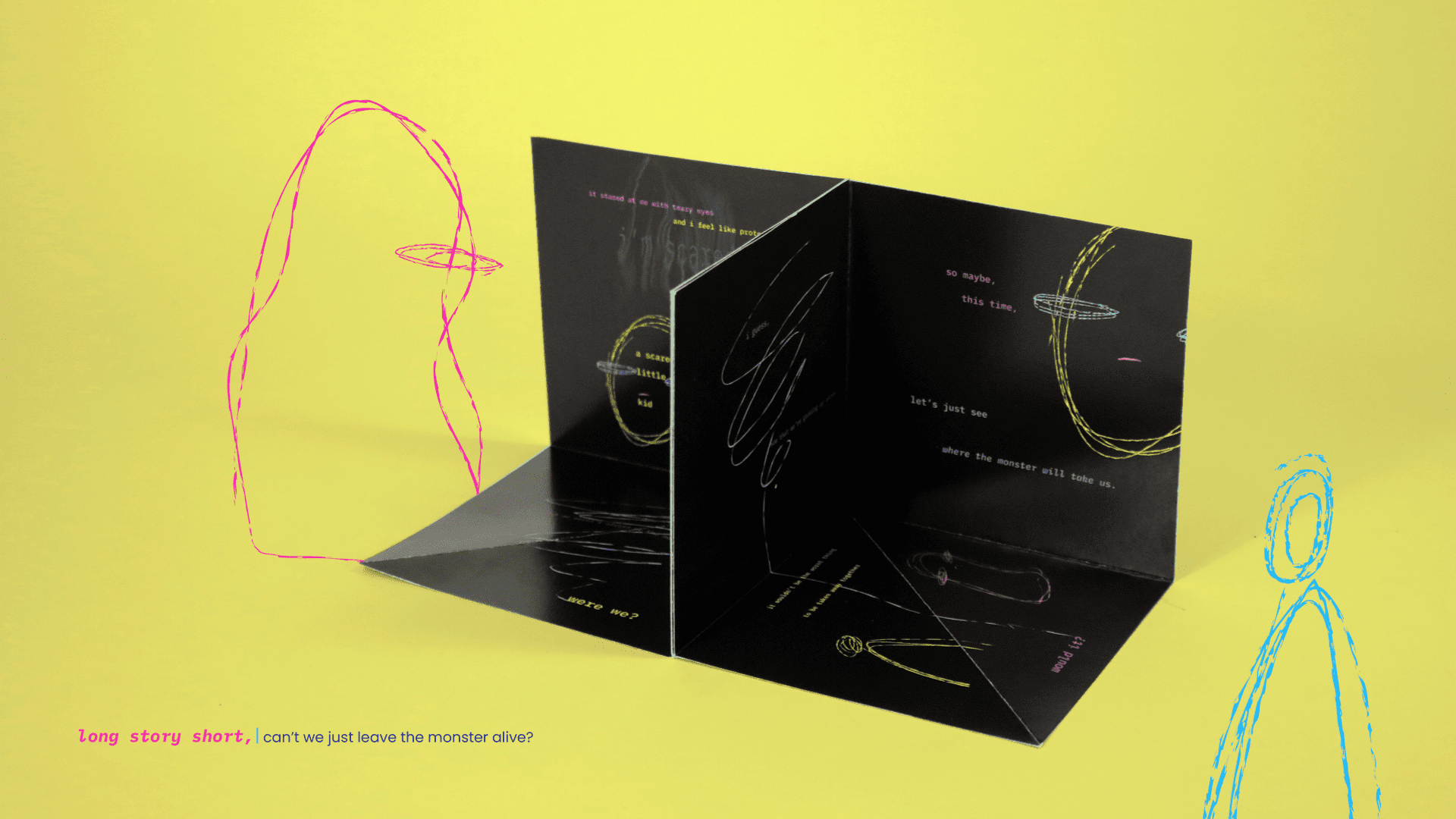
“Can’t We Just Leave The Monster Alive?” uses the imaginary figure from a lot of people’s childhood: the monster under the bed. Through this motif, this chapter explores how anxiety, imagination and fears affect a young adult’s psychological and emotional response to isolation during the pandemic. This zine has a black background, and starts out with the “dear you” greeting type treated in a distorted way. This indicates the lack of clarity and the presence of fear in the young adult when they are talking about the monster. The zine then opens up into 2 open 5”x5” cubicles. These represent the rooms that the writer was stuck in when they were writing this letter. When time passes and the writer is revisited by the monster under the bed, they realize that it was the anxiety and fear of darkness when they were a child that made them afraid of the monster, and the monster itself wasn’t really scary. In this letter to their friend, the writer said that this monster “is just a scared little kid, just like you and me.” Upon this realization, the distorted type treatment disappears, and the monster became a friend that stays alongside the writer when they were all alone. If the reader turns the zine upwards to “check under the bed,” they can see the little monster hiding in there, and a note from the writer saying “thank you for being my friend.”
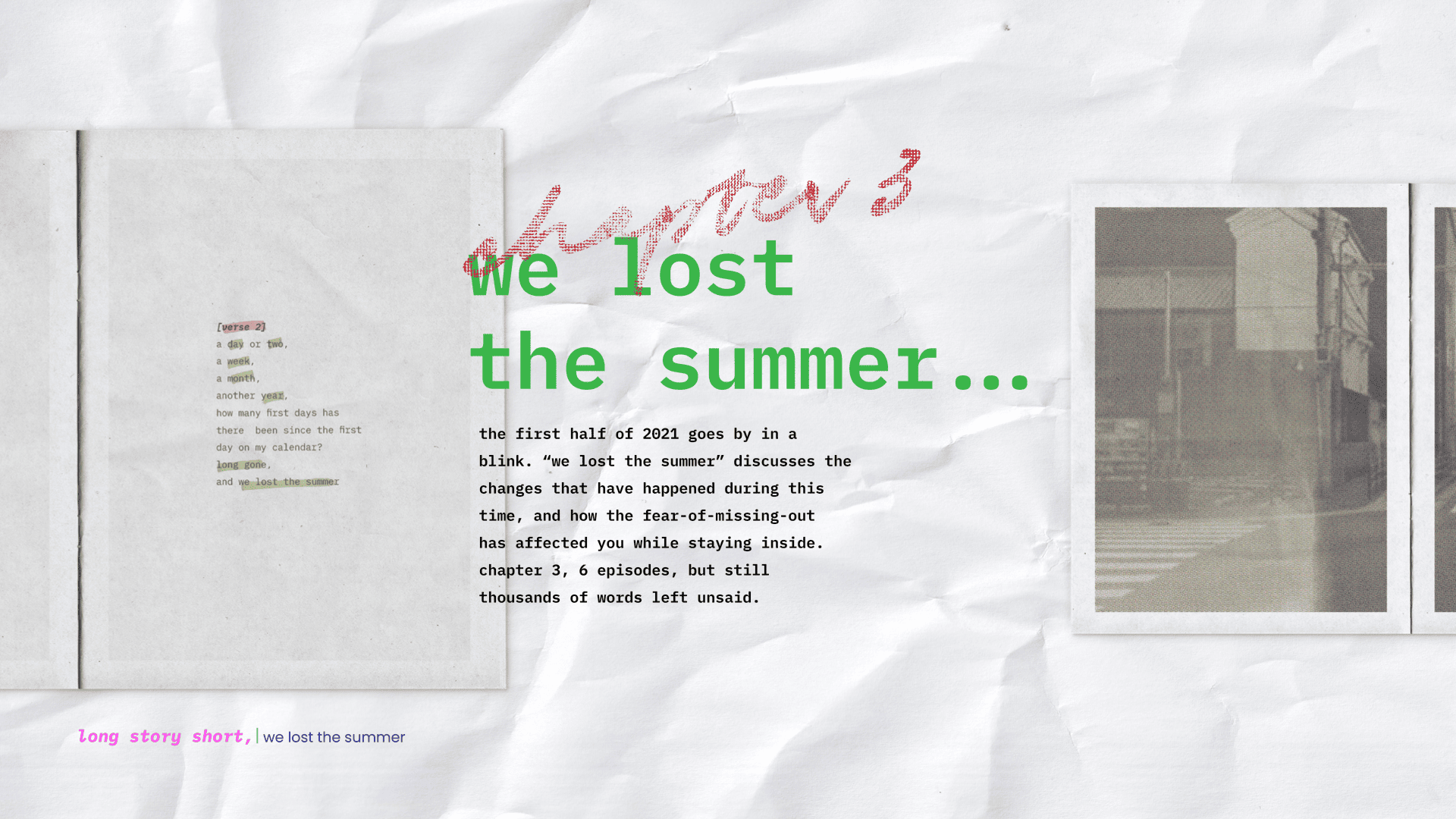
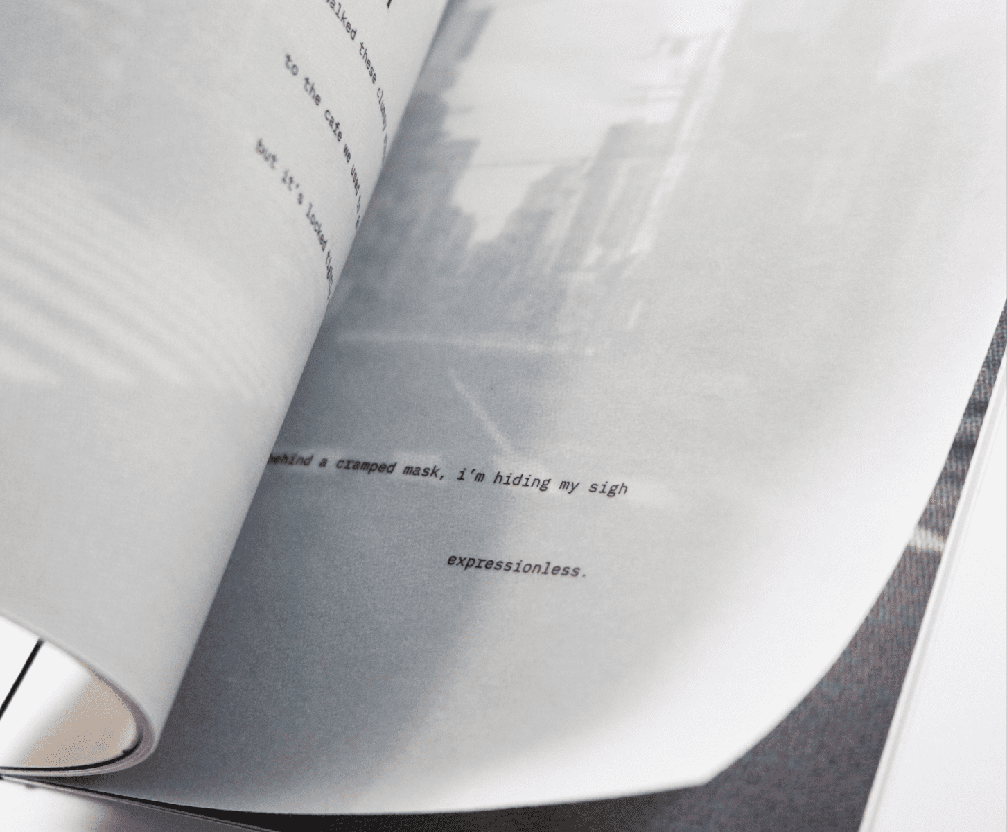
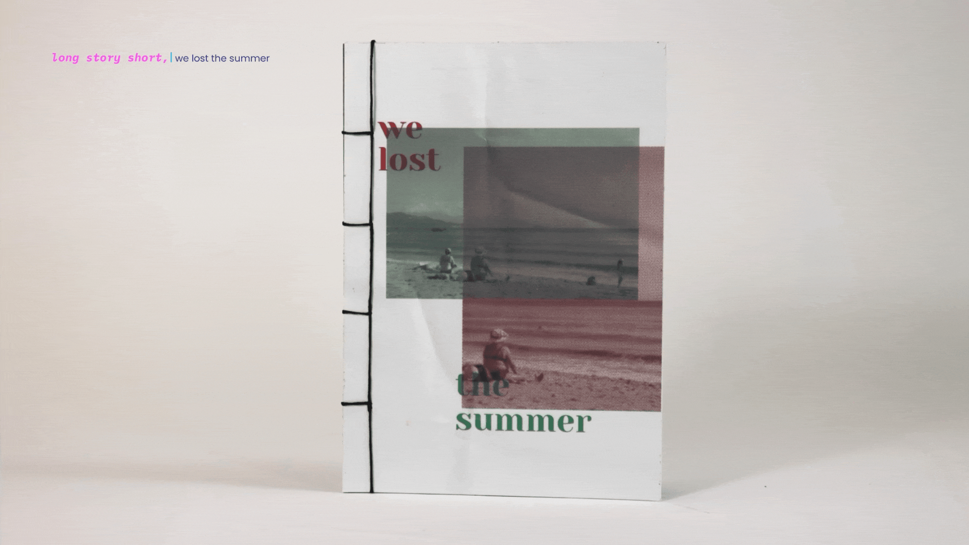
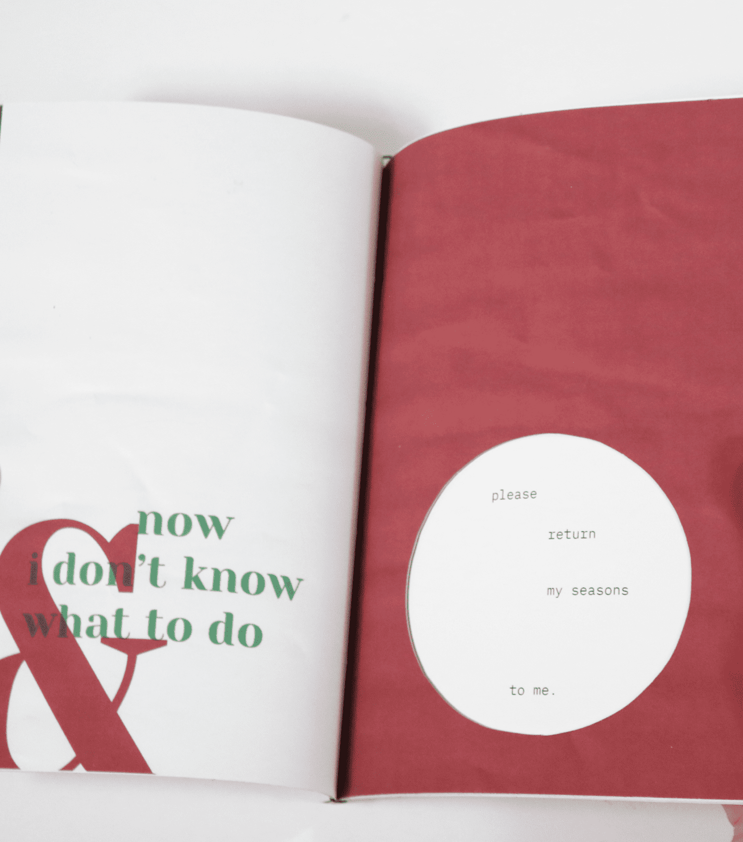
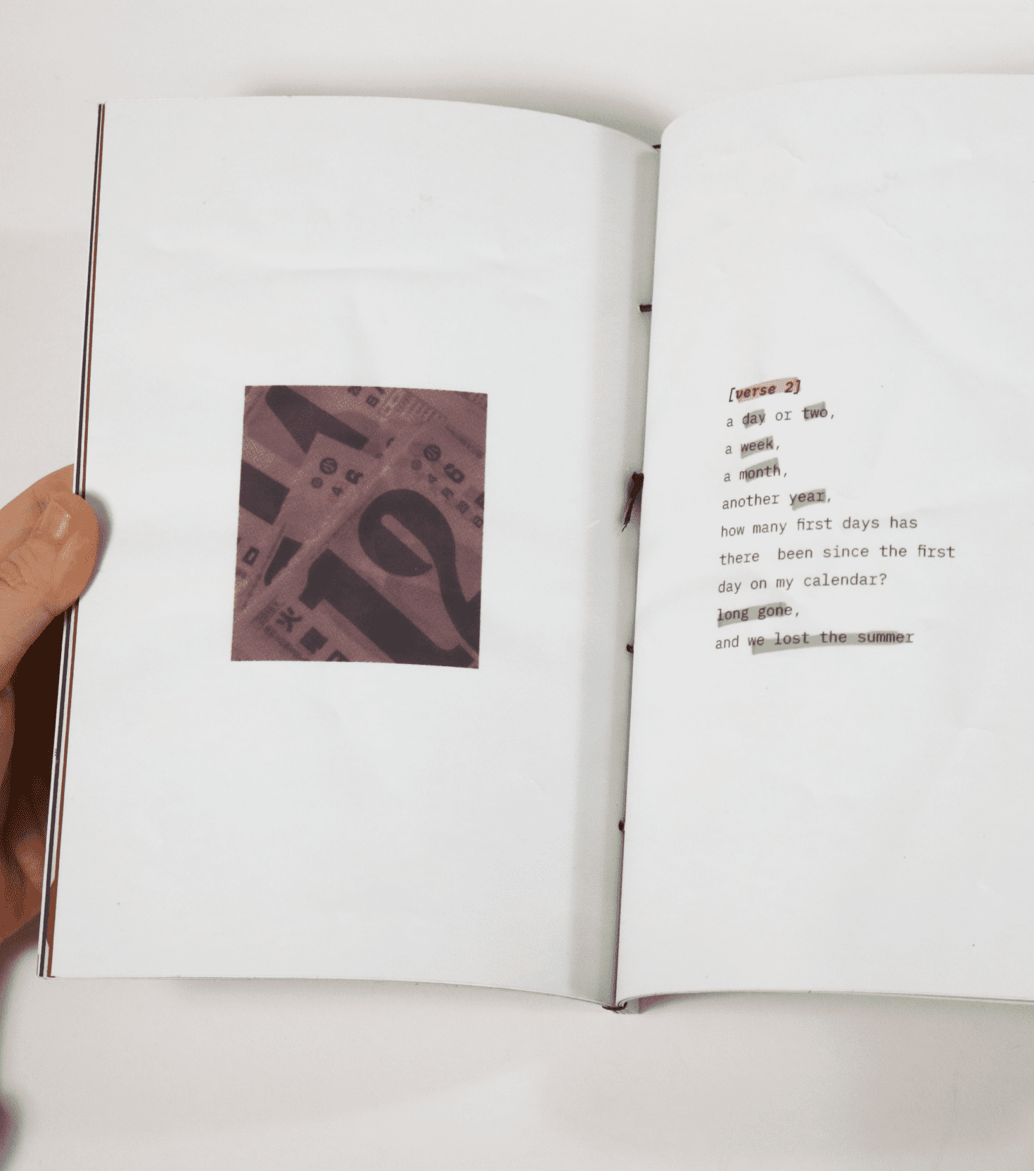
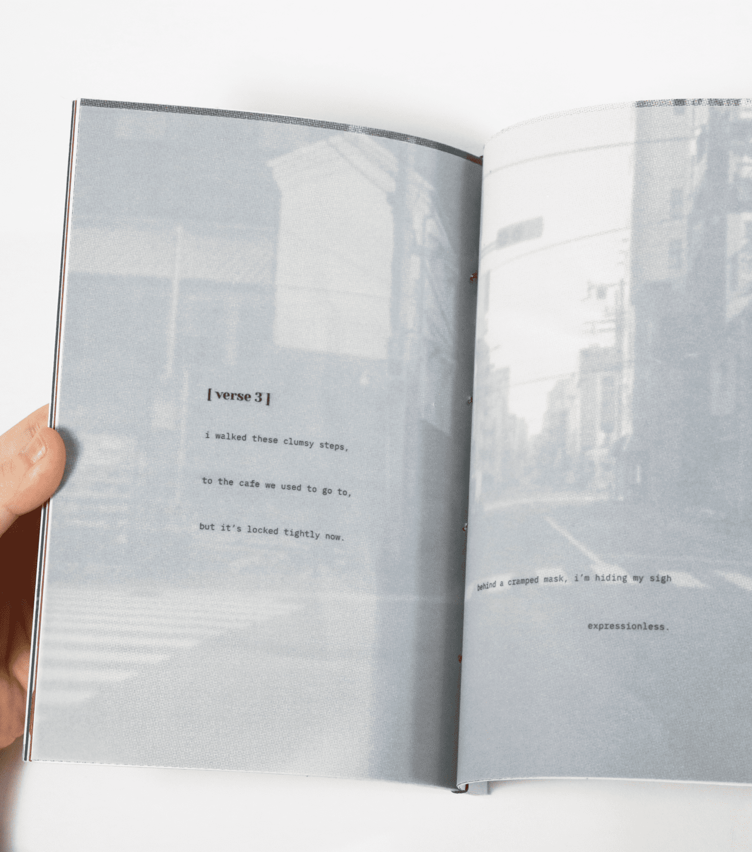
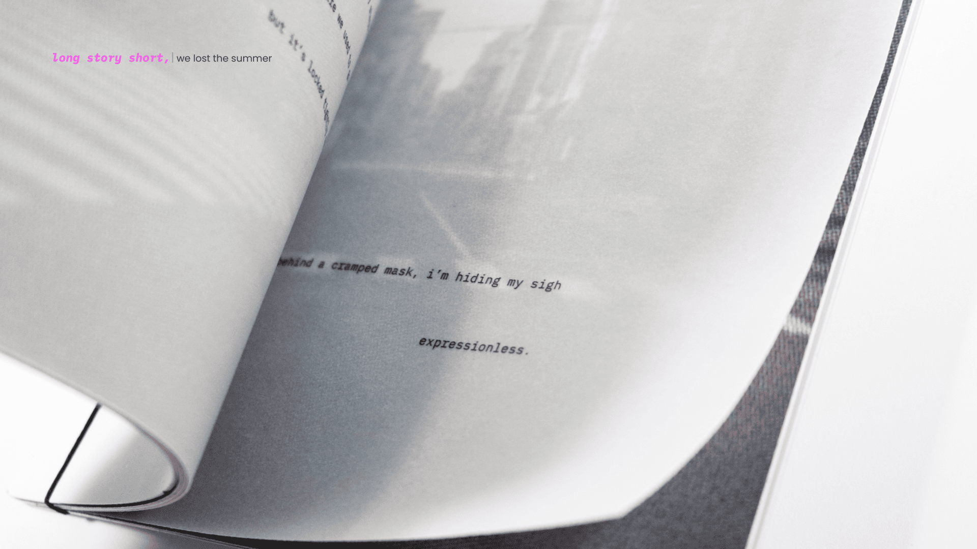
“We Lost The Summer” discusses the events that happened in the first half of 2021, and how the fear of missing out (FOMO) has affected young adults while they were staying inside. This booklet is bound together by the Japanese stab binding method, and is more photographic in its treatment. It is a train of thoughts inside the writer’s head, a lot of walking back to the places they went to before lockdown started, how every day feels like an endless winter, and how they have lost a summer. This booklet uses transparent papers in some pages in order to show the thoughts in the writer’s head while they are at that specific location. The cut-out page shows the uncertainty of the writer and how they want the time the have lost be returned to them.
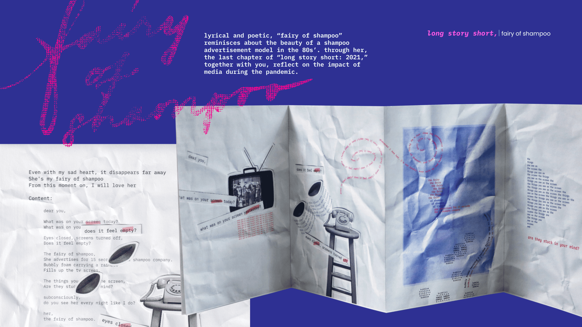
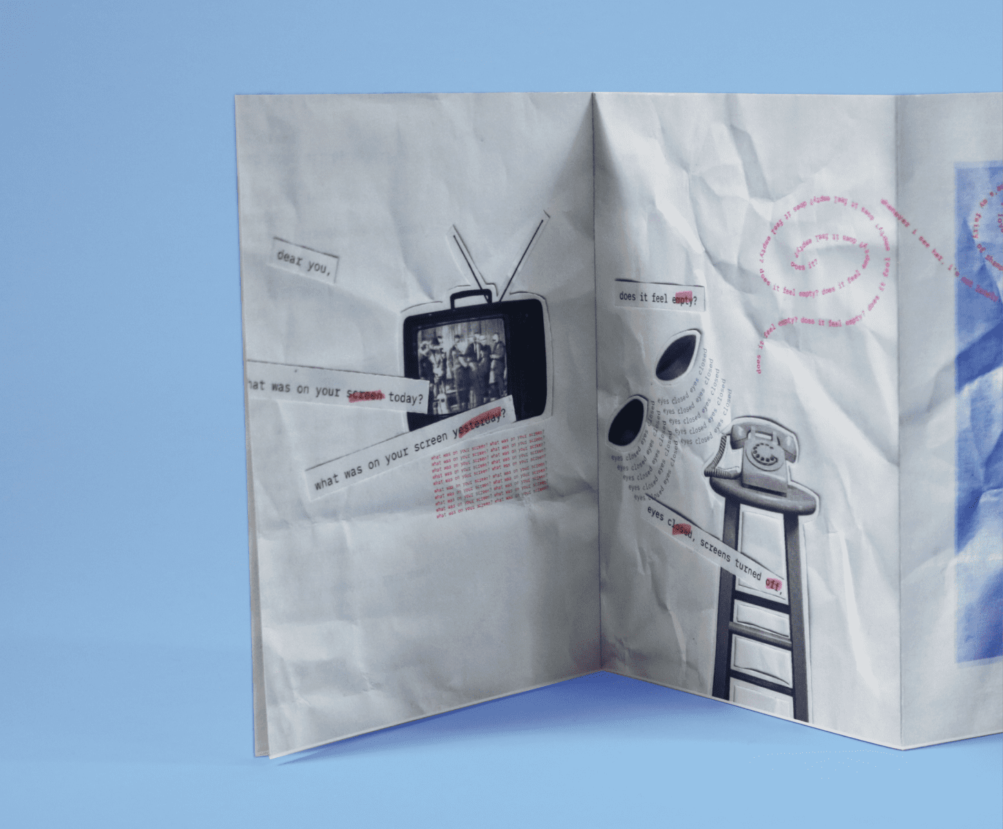
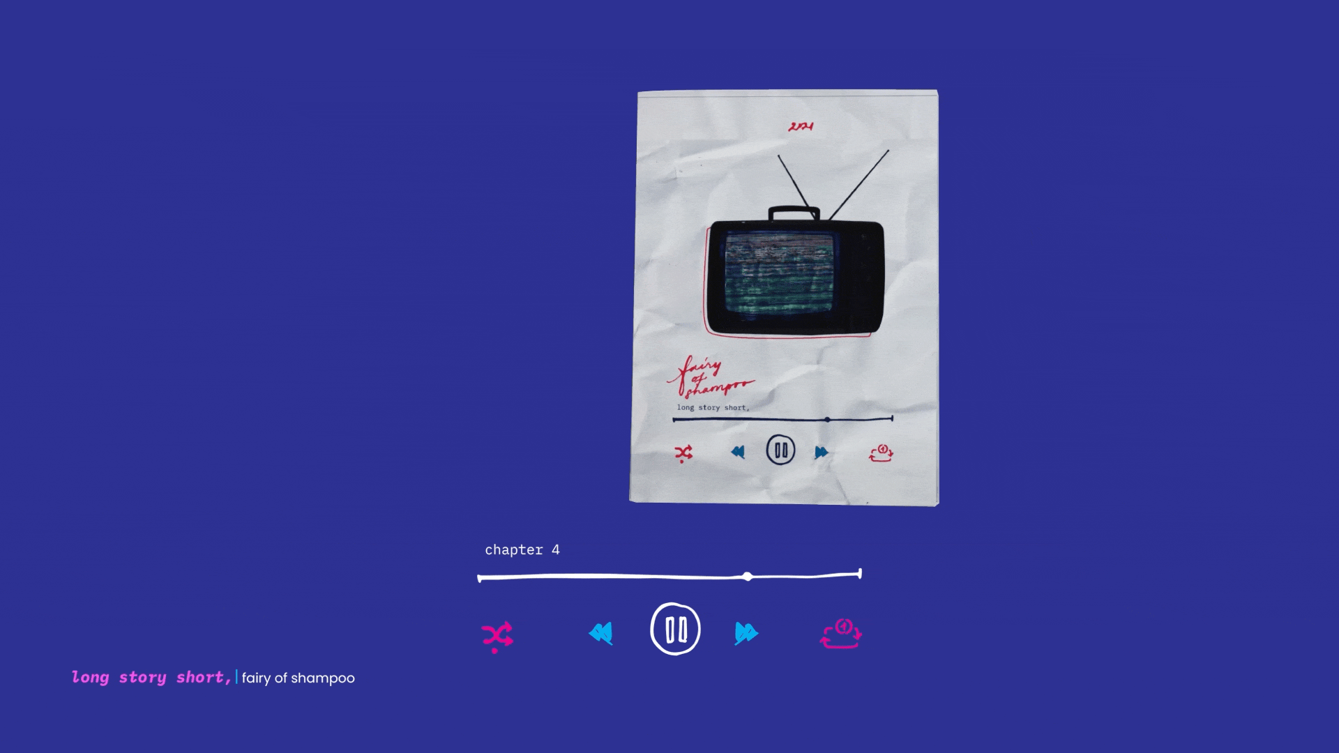
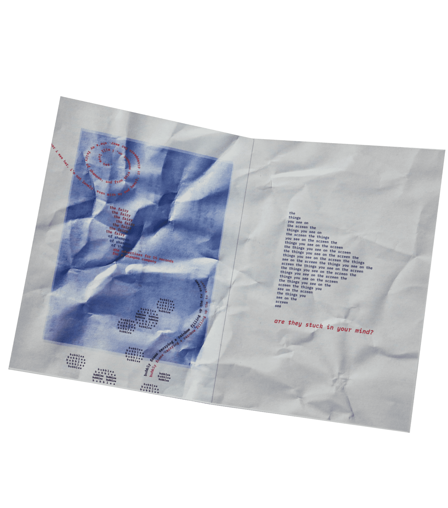
“Fairy of Shampoo” is lyrical and poetic chapter, which reminisces about the beauty of a shampoo advertisement model in the '80s. Through this motif, this chapter talks about mainstream media and its impact on young adults during the time where they are consuming more content than ever before. This chapter uses graphic collage elements that relate to the perception of what media is. With the front cover being a familiar music screen and opening up into the TV, phones, eyes, and a lot of repeating copy, “Fairy of Shampoo” highlights the repetitive nature of mainstream media. Everything is repeated, but each time, we still consume this content. This zine also opens up into a poster that readers can hang up in their room or keep as a collectible.
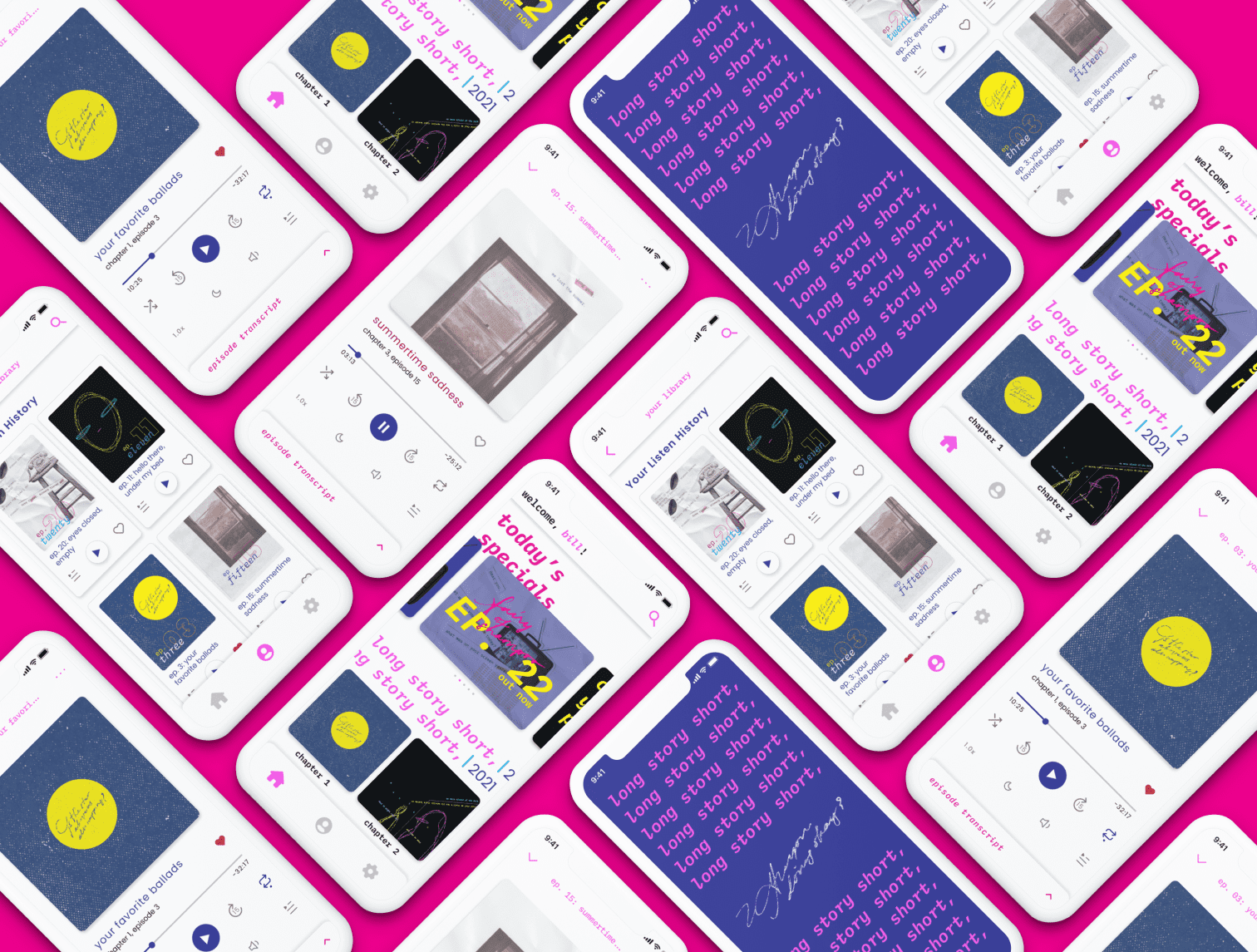
All the podcast episode can be accessed through the “long story short,” app. Click on the "figma prototype" button to find the full app prototype, which includes 4 main user task flows: viewing the home screen, listening to a podcast, viewing a category on the home screen, and navigating to the subscription service.
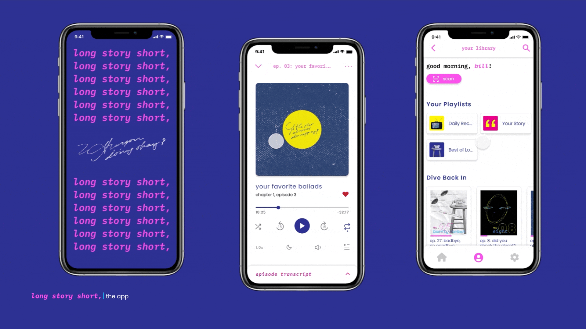
Via the scan feature on the app, I’m working on a prototype that lets users scan the zines from their subscription service and unlock a digital environment for the zines and users can also earn in-app rewards by doing this. I believe that this augmented reality feature could be a part of the marketing plan for the product, since a lot of companies have campaigns that utilize this kind of technology as well.
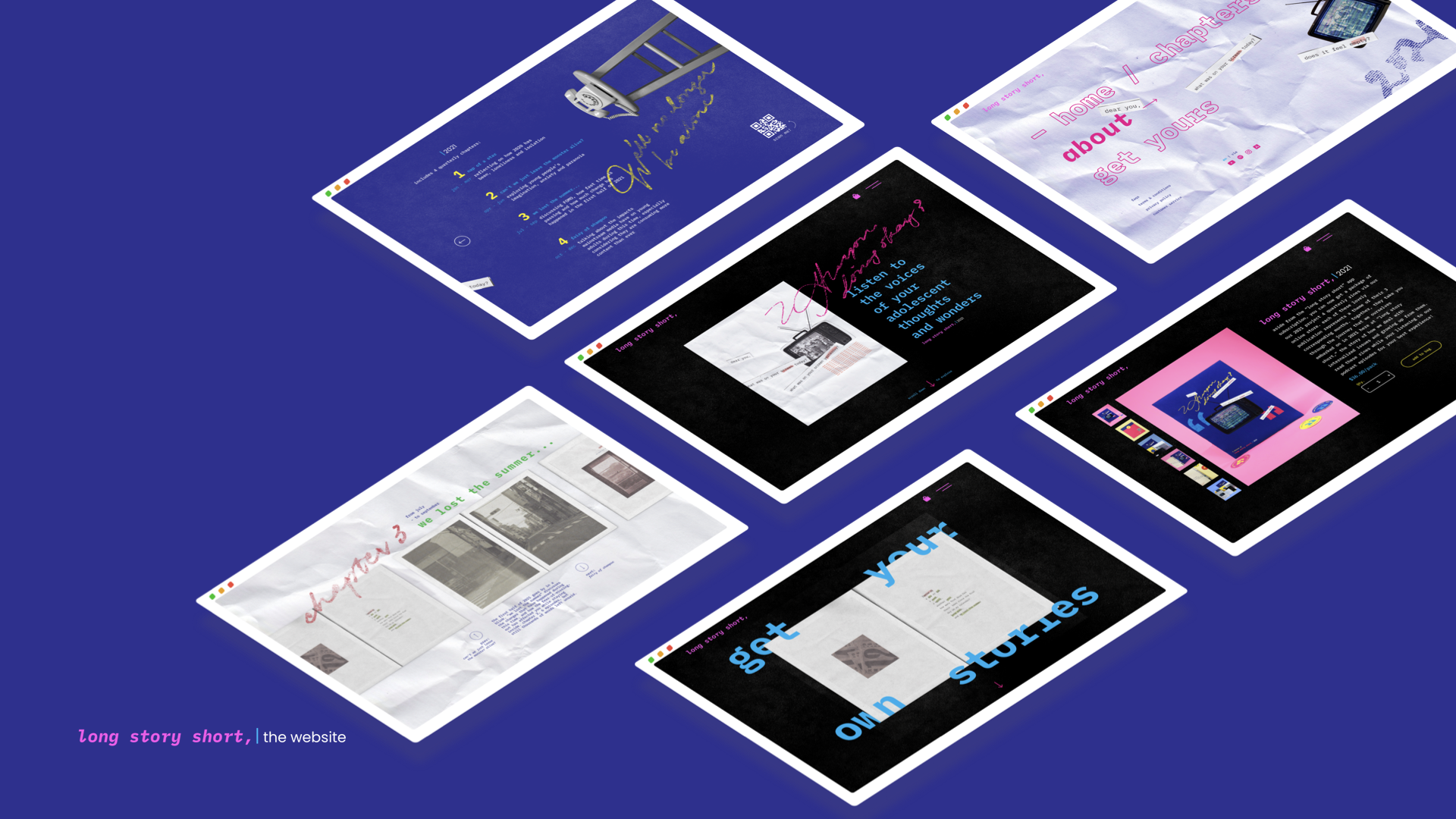
This website is an information source, where listeners or interested people can read more about the podcast without having to download the app. At the end of 2021, the store page will open for interested people to purchase all 4 of the chapter zines. This page only goes live after all subscribed members on the app have received their publications.