An exhibition promoting inclusive & accessible design for visually impaired individuals

An exhibition promoting inclusive & accessible design for visually impaired individuals

2021

2021

Project Type

Academic project at Drexel University

Duration

4 weeks

Tools

Adobe Illustrator & Photoshop, Figma, Python

Deliverables

Exhibition wall mock-up, functioning Grade 2 Braille translator

Project Type

Academic project at University of Washington

Duration

10 weeks

Team

Figma, Adobe Illustrator, Miro, Slack

Role

Interactive smart piggy bank prototype, application prototype

Team

Team

Individual Project

Role

Role

Designer

/ problem discovery

/ problem discovery

/ problem discovery

Most people with a visual impairment retain some residual vision, yet accessibility strategies and research for visual art focus on non-visual aids and strategies.

Most people with a visual impairment retain some residual vision, yet accessibility strategies and research for visual art focus on non-visual aids and strategies.

In the study Art for All: The Situation with the Observance of Cultural Rights of People with Disabilities in Ukraine, two-thirds (66.9%) of people with visual impairments in Ukraine consider art and participation in cultural life important in their lives: 42% strongly agree with this statement, and almost a quarter (24.9%) rather agree. However, currently, in Ukraine, and in the world in general, art spaces are practically inaccessible to visually impaired people. This sparked the question —

How Might We spread awareness on accessible design & educate designers on best accessibility practices when designing for people with visual impairments?

How Might We spread awareness on accessible design & educate designers on best accessibility practices when designing for people with visual impairments?

/ project objectives

/ project objectives

/ project objectives

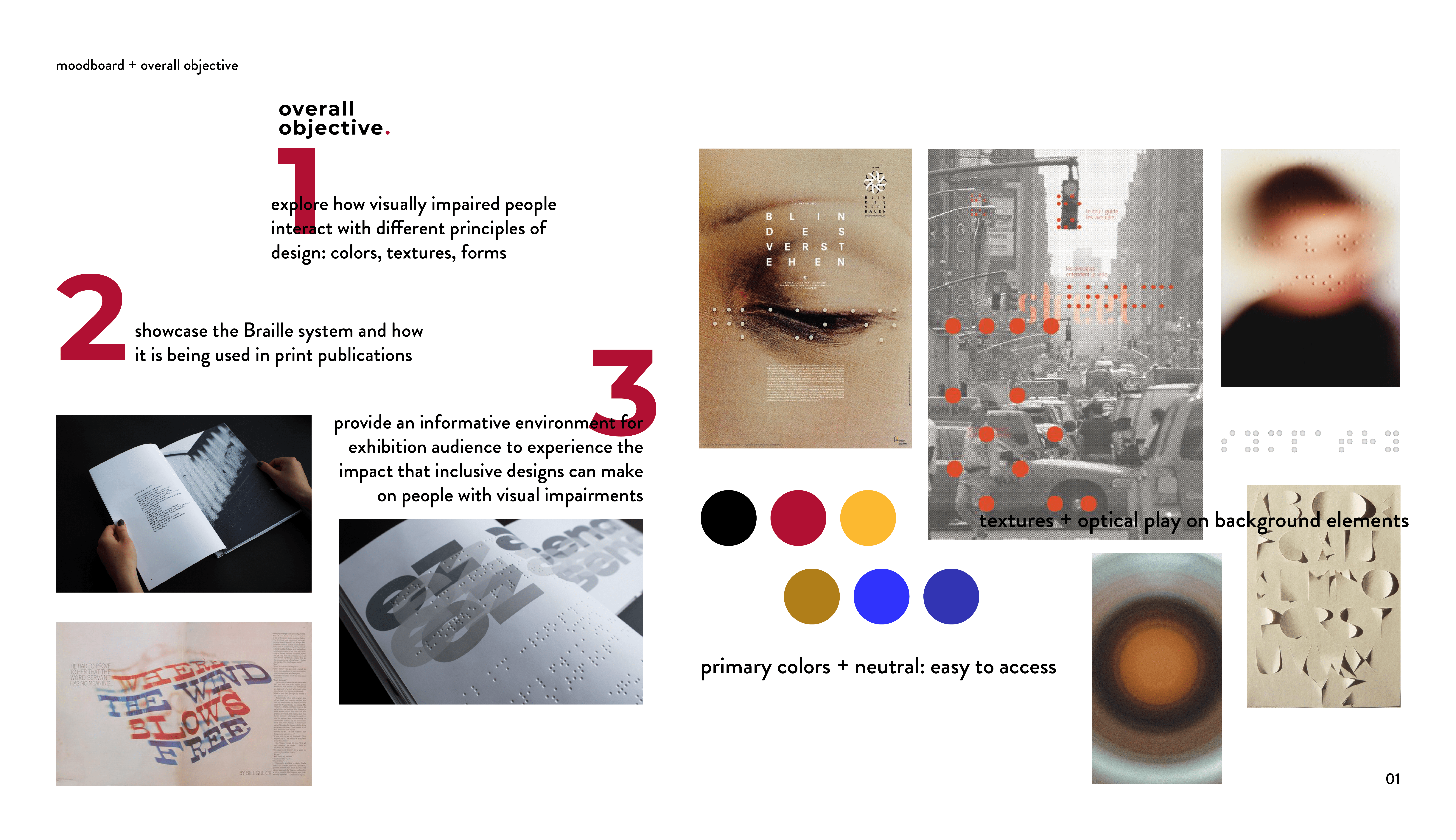
The exhibition was designed to foster a tactile, immersive experience, encouraging participants to reflect on how visual impairments affect daily interactions with design.

The exhibition was designed to foster a tactile, immersive experience, encouraging participants to reflect on how visual impairments affect daily interactions with design.

With hands-on demonstrations, interactive elements, and informative displays, the goal was to educate visitors on inclusive design's importance and provide insights into Braille’s role in accessibility. This project aimed to bridge the disconnect between mainstream design principles and the sensory needs of visually impaired individuals. By educating the public on Braille and the experience of sighted and visually impaired users, the exhibition sought to promote empathy and inclusivity in design.

/ ideation & two rounds of testing

/ ideation & two rounds of testing

/ ideation & two rounds of testing

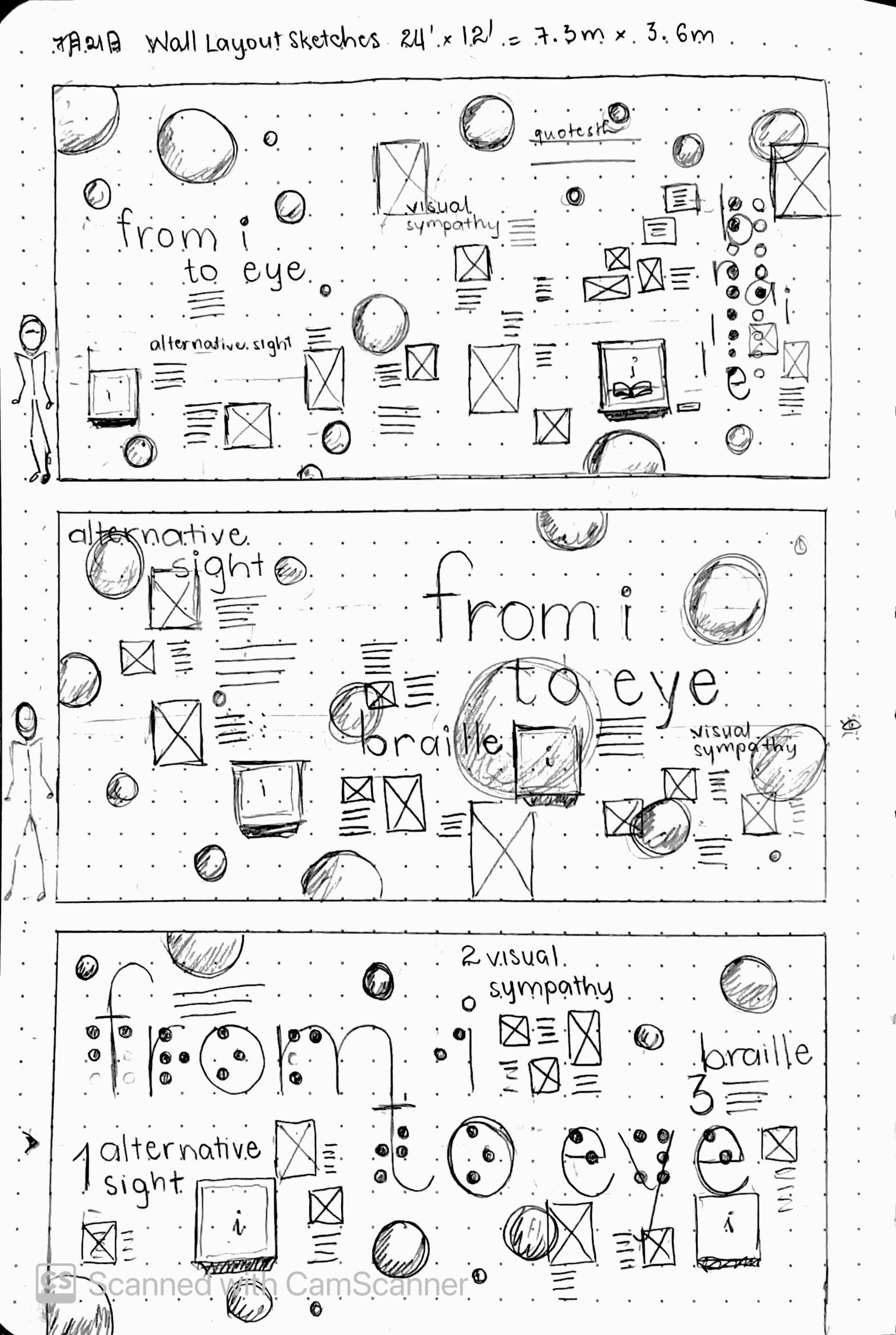
I started with sketches to conceptualize the exhibition wall’s layout, interactive elements, and visual style.

I started with sketches to conceptualize the exhibition wall’s layout, interactive elements, and visual style.

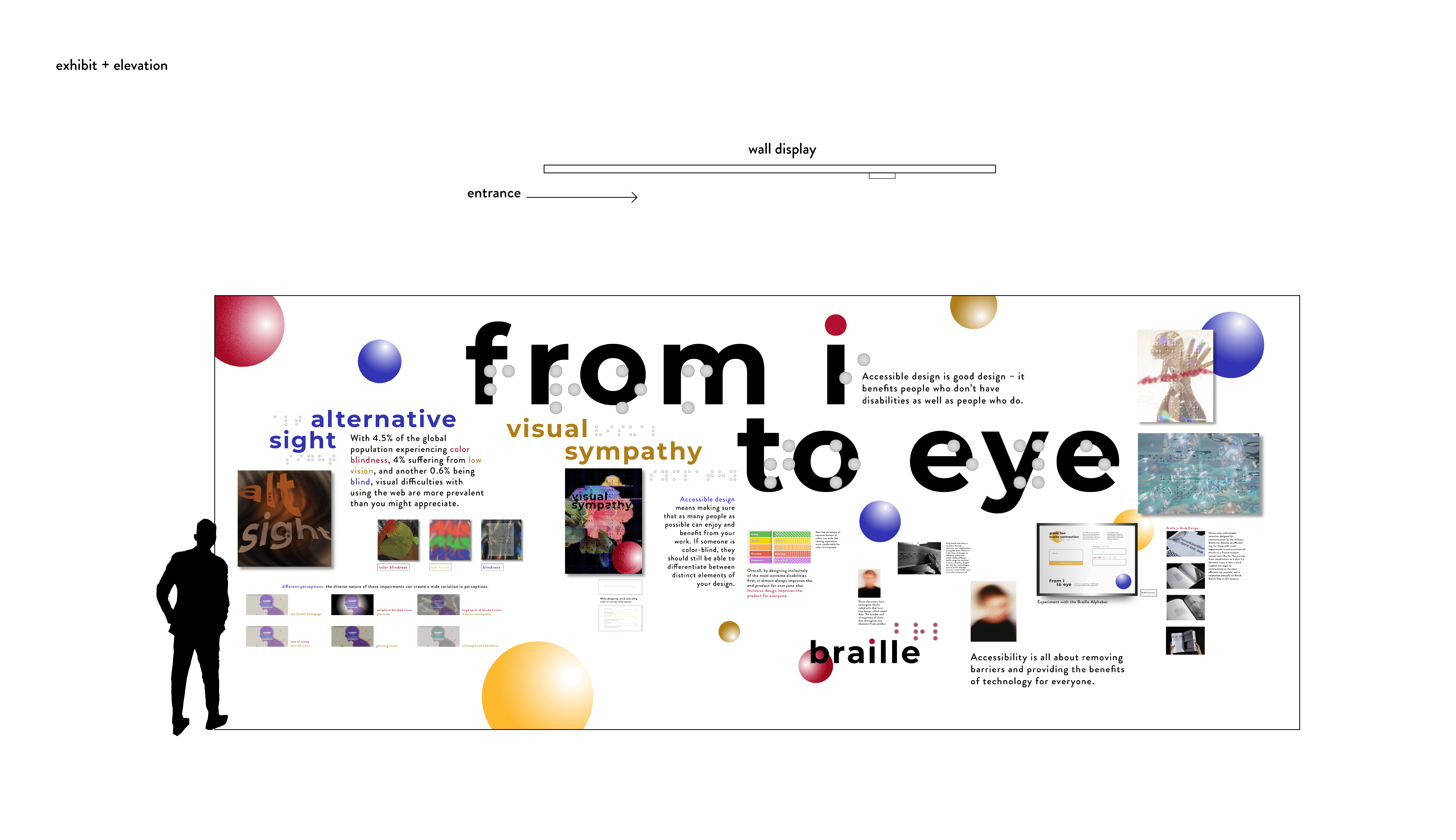
Using the Braille-inspired circle motif as a key visual element, I sketched out 3 different flows of information that exhibition viewers can follow.

After these 3 sketches are done, I presented them to 12 possible exhibition viewers, most of whom are other design students at Drexel University. 80% of them thought option 3 best presented the information flow and visual hierarchy. The other 20% believed option 1 was the most straight-forward.

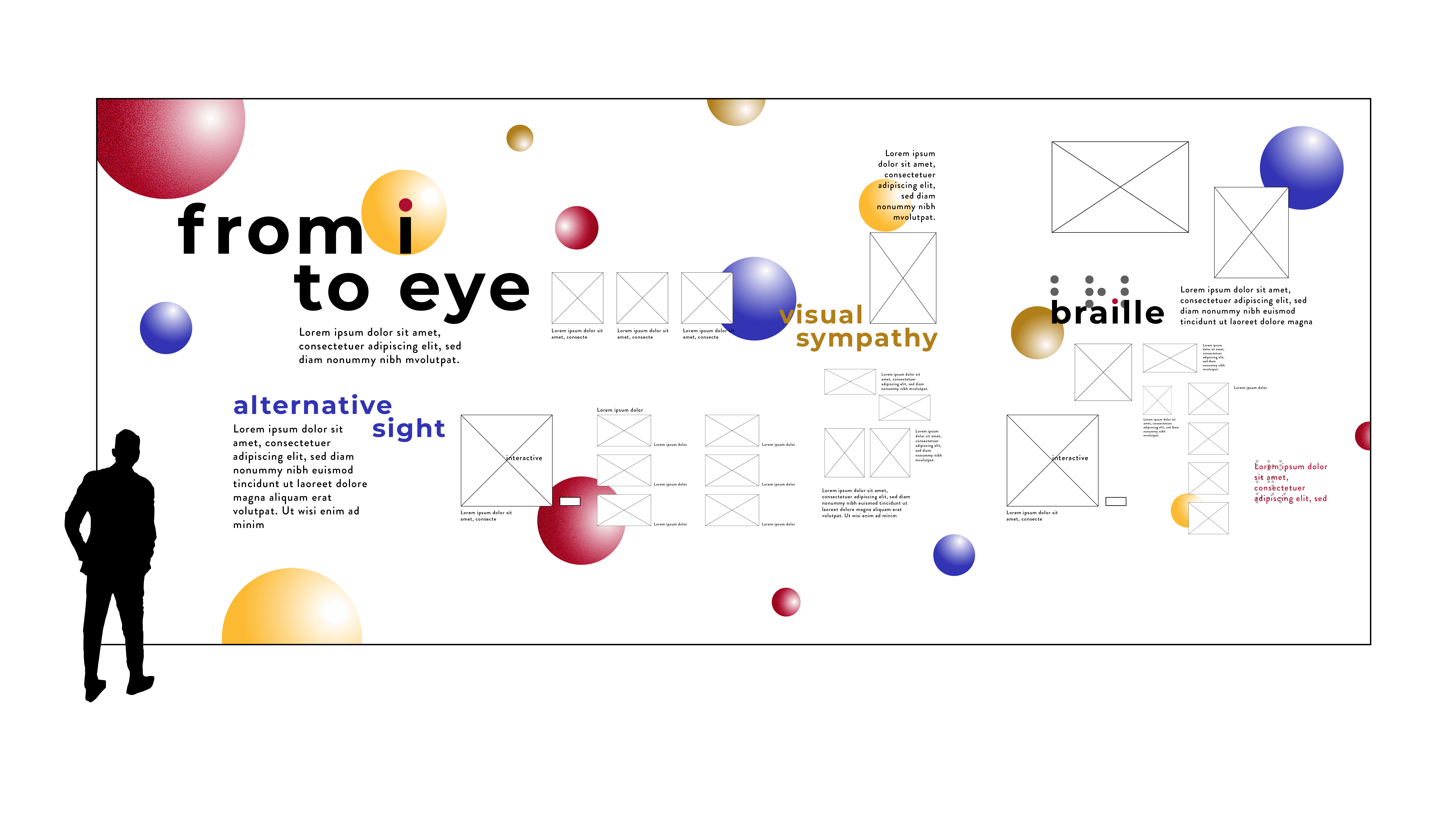
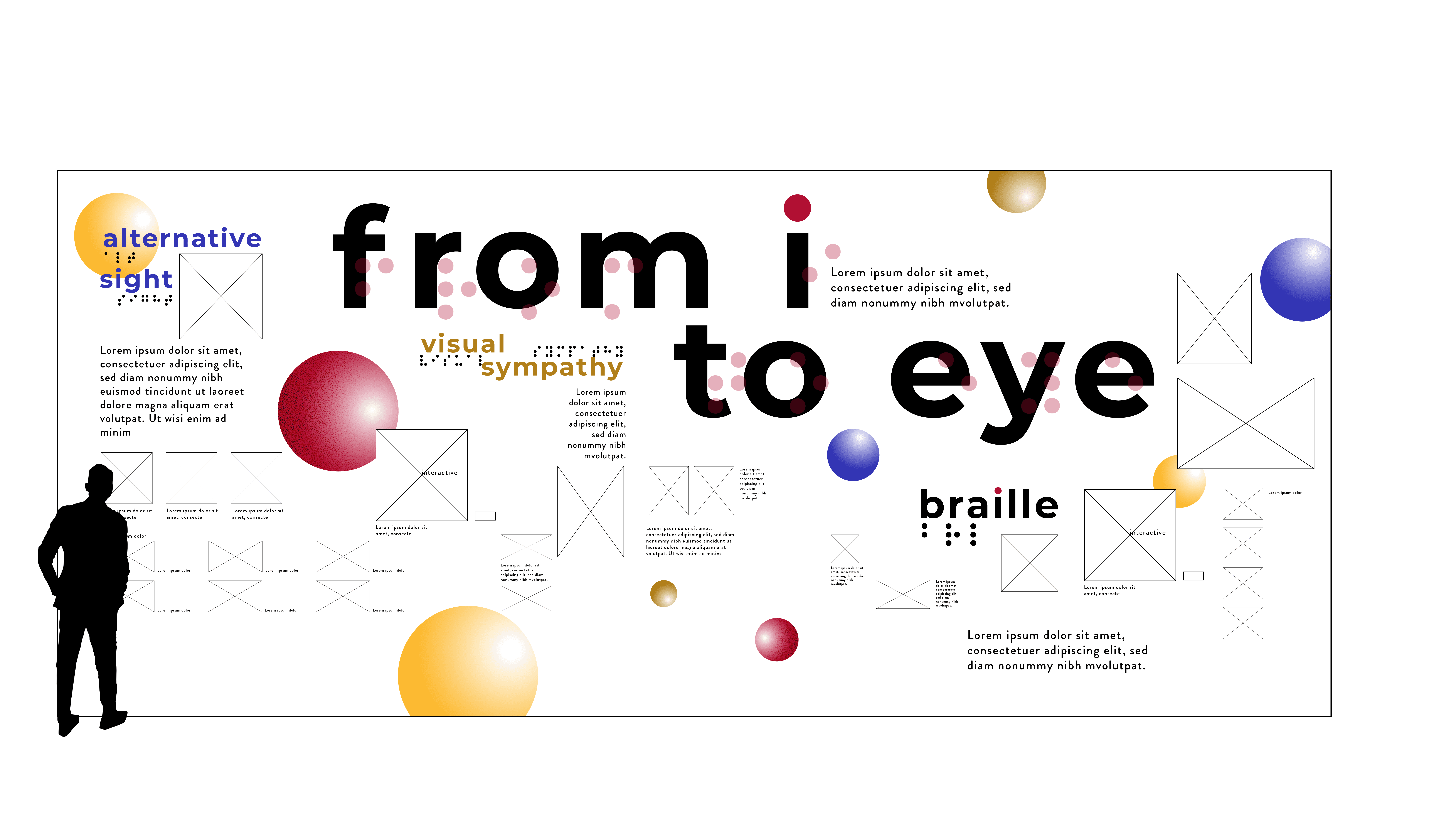
So I worked on developing these 2 options digitally, and sent them out again to a different group of designers.

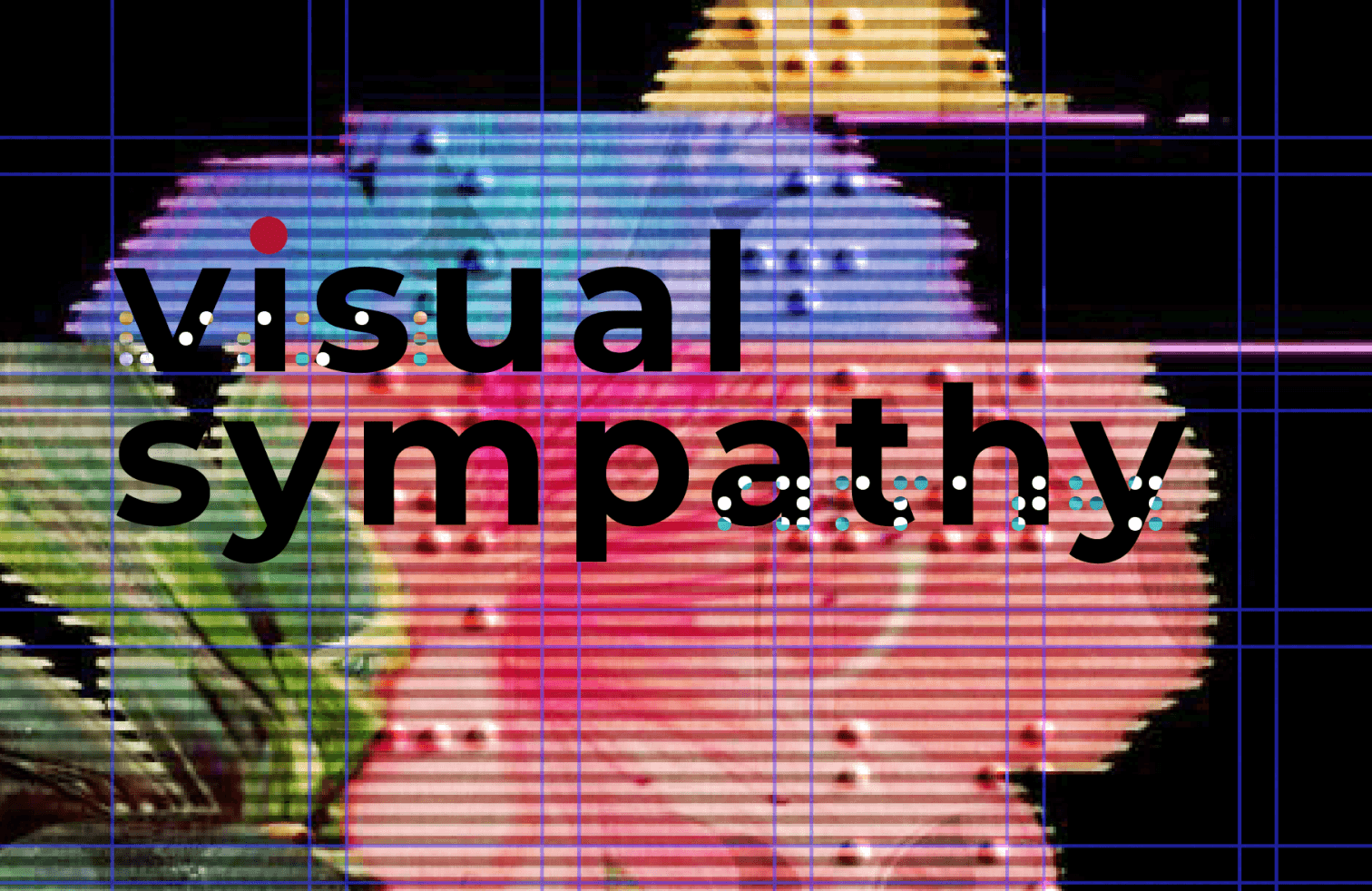
The majority of these designers chose the option with a large masthead, stating that it had more impact on them while still being easy to follow. They thought the other option had a good information flow as well, but some information on the top of the Visual Sympathy section might get lost if the design got implemented at full scale.

/ exhibition wall & elevation

/ exhibition wall & elevation

/ exhibition wall & elevation

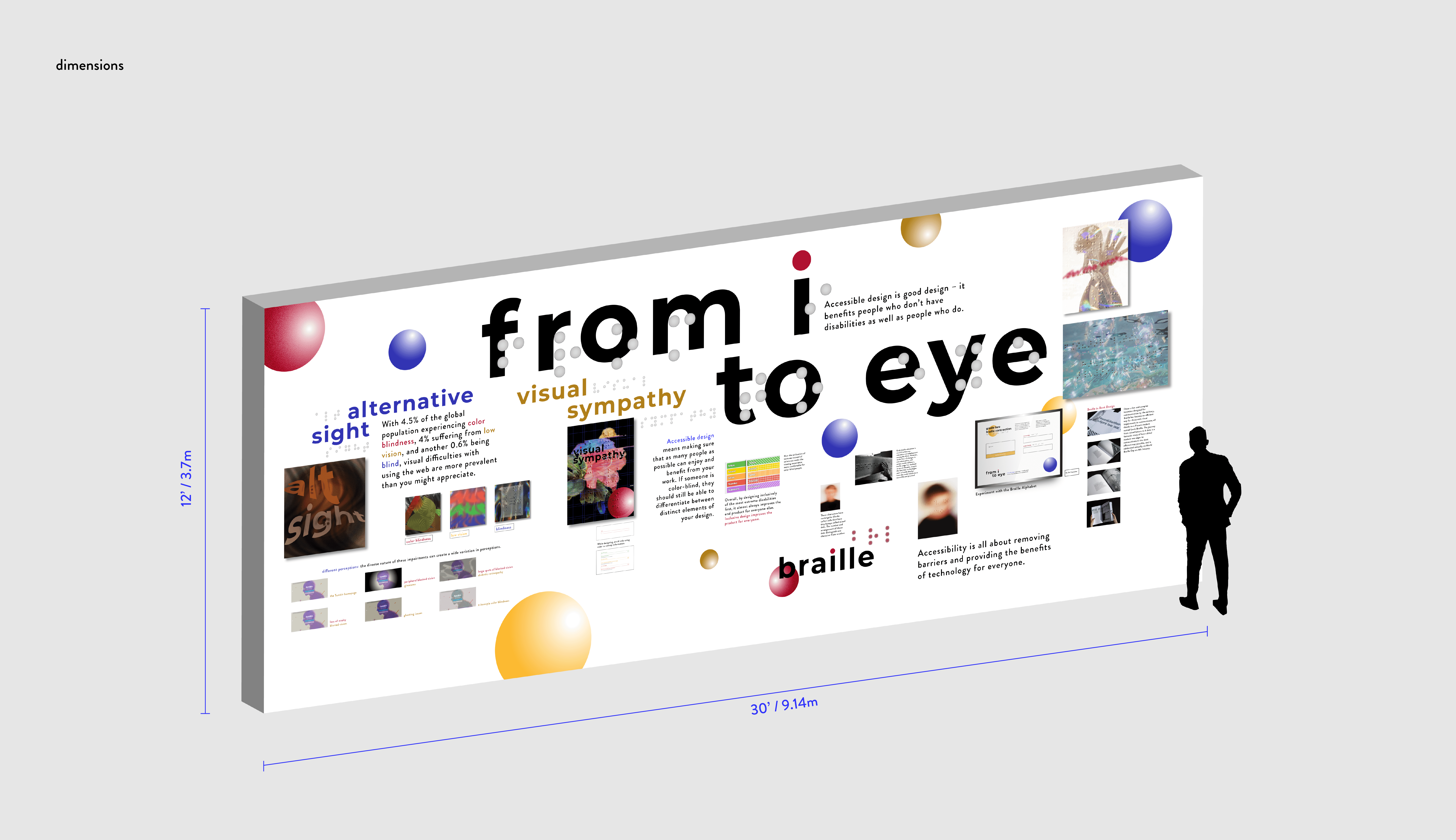
The exhibit was divided into three sections—Alternative Sight, Visual Sympathy, and Braille Basics—each focusing on different facets of visual impairment and accessible design.

The exhibit was divided into three sections—Alternative Sight, Visual Sympathy, and Braille Basics—each focusing on different facets of visual impairment and accessible design.

The exhibition wall takes viewers through these 3 sections:

  1. Alternative Sight: How Visually Impaired People Perceive the World

  2. Visual Sympathy: How Inclusive Thinking in Design Benefits Visually Impaired People and Best Practices in Accessible Design

  3. The Braille Alphabet System for the Visually Impaired

/ interactive grade 2 braille translator

/ interactive grade 2 braille translator

/ interactive grade 2 braille translator

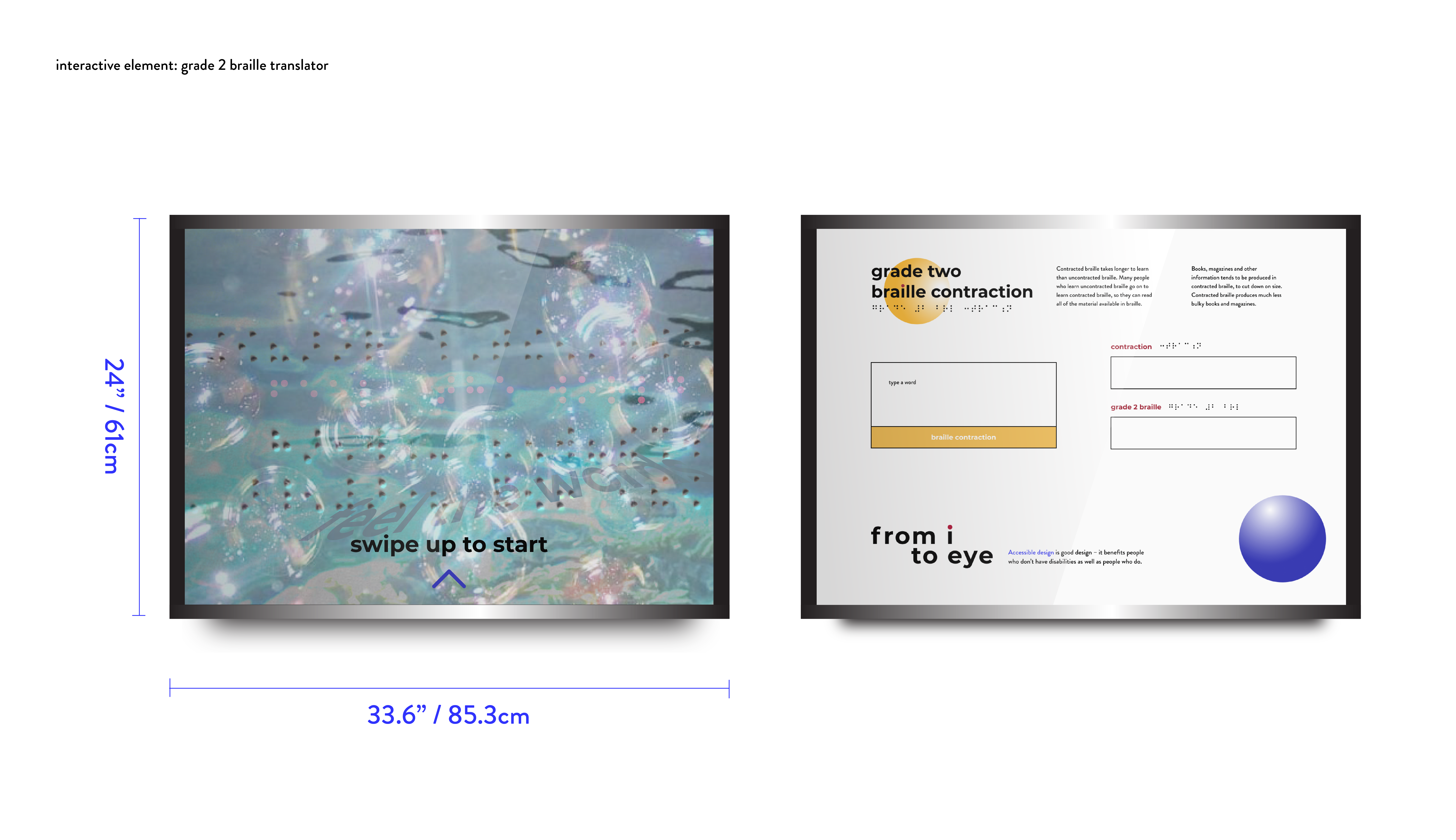
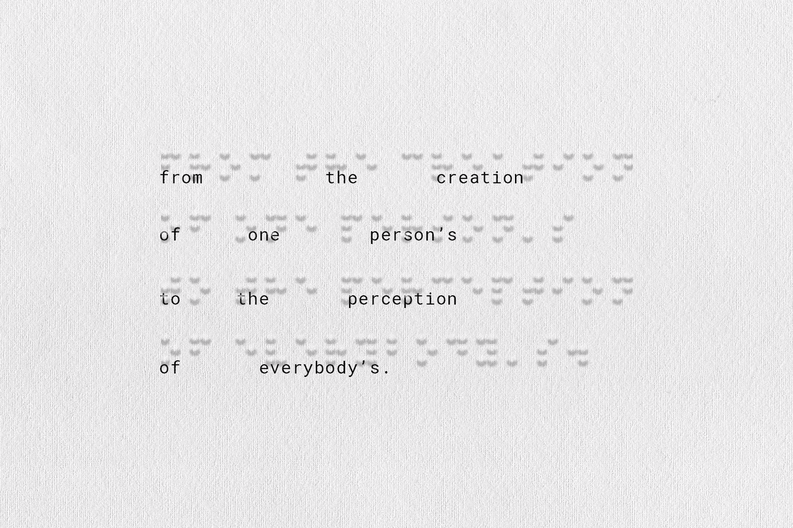
The exhibit offers an Interactive Braille Translator for its viewers to learn about grade 2 braille, also known as contracted braille.

The exhibit offers an Interactive Braille Translator for its viewers to learn about grade 2 braille, also known as contracted braille.

The literary system of braille for English, French, and many other languages has evolved to develop an extensive array of "short forms" or "contractions" for commonly-occurring words or groups of letters. For example, the word "the" is often represented as a single character.

This translator was developed using Python, with references to the Unified English Braille (UEB) Chart. Contractions are defined in terms of sequences of letters, and generally are used without respect to pronunciation, meaning, or sublexical structure, unless the rulebook specifies otherwise (Englebretson et al., “The Primacy of Morphology in English Braille Spelling: An Analysis of Bridging Contractions”). Because of this, a 100% correct braille translation can only be done by a human, as this requires an understanding of the text content.

/ project takeaways

/ project takeaways

/ project takeaways

I designed this project as a graphic design student in 2021. How can I improve this design now with more user research?

I designed this project as a graphic design student in 2021. How can I improve this design now with more user research?

This project successfully highlighted the importance of accessible design in creating meaningful experiences for users with unique sensory needs. As this was one of the projects that started my passion for accessible design, I revisit it from time to time and think about how I can improve it now with more knowledge on user-centered design.

I think it is important to conduct more preliminary qualitative research on how people with visual impairments navigate local art spaces (museums, gallery, etc.) with ethnographic methods and using surveys/questionnaires/interviews to gain insights on how designers of these spaces engineer their design for visually-impaired users. This can help me gather data on what information designers currently lack, and better locate resources to help them create more accessible spaces.
/ thank you for stopping by!

/ thank you for stopping by!

/ thank you for stopping by!